Sunday, November 24, 2013

Photoshoot

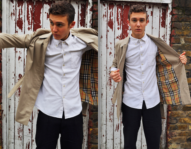
 "Author's own, Burberry themed photo shoot"
Here is the photo shoot that i produced in conjunction with my other Burberry related work. The images show the model [Joe] posing in Burberry style clothing, i styled the images making sure they still had Burberry's prorsum values e.g. slick, stylish and traditionally British… I chose this model because i think his look is iconicity British, and with the decayed, abandoned location  it contrasted flawlessly with the pristine look. I chose a verity of outfits for the model to try on based on what our design team had produced as well as keeping it typically Burberry. The design team were designing for the A/W14 collection so shirts, polo necks and scarves were incorporated in to the designs as well as the iconic Burberry trench, i experimented with the way the outfits were styled, combining blazers and polo necks to shirts and scarves.  I am extremely happy with the shots that are composed against the door with the dark red and white paint peeling off, i think the lighting if perfect, reflecting the red onto the subject making him appear glowing and fresh faced, exactly what i was looking for , for this shoot. I am also fond of the  slight appearance of the burberry check , which also works perfectly with the red door and the tiny fragment of red in the pattern. 

The four images above are ones that i was most happy with, I like the way that the model is moving but also the way I have managed to capture the movement without blurring the garments. It adds character to the images and catches an essence of reality which i think is good when promoting clothing because it allows real people to see the clothing in action and to visualise it from a realistic perspective.


Sunday, November 17, 2013

Promotion-Burberry

Personal Promotional Work:
An idea i came up with to promote the fashion show was to hold an event at all the prestigious department stores in all the major fashion cities such as Paris, Milan, London, NewYork & Japan… The event would be open to the public but published on fashion blogs in advance for fashion students/bloggers to attend. The event will consist of people being able to design there own postcard using a range of pre-designed stamps based on the Burberry AW14 collection. It is a free event allowing people from any background to participate, we purposely made an event that created no language barriers so every could have involvement and we would receive as much publicity and promotion as possible. The postcard would have some details of the BurberryAW'14 fashion show and can be sent to any one any where free of charge on behalf of Burberry, following in many fashion blog posts (promoting the event more). Here are some of the stamps that i designed for the event:


 "Author's own, Stamp designs"
 "Author's own, Coin elongating designs"


At the event people will also be able to donate to Burberry's ongoing charity The Burberry Foundation, it was established in 2008, and is an organisation dedicated to helping young creatives with little financial stability follow their dreams and fulfil potential through the power of their creativity. The Foundation works to help young people gain confidence, build connections in their communities, and grasp opportunities to succeed. Donations will be taken through the process of an coin elongating machine, people will be asked to make a donation to the fund and in return they will get a unique engraved coin with a Burberry design imprinted into it, that will entitle people to receive a free drink at the fashion show. I have also designed some prints that can be embossed onto the coins [see above]

 "Author's own, Ticket/Wristband in action"


As a team we decided it was a good idea to involve fashion students and bloggers, so, at the event we chose to put a maximum of 70 tickets on sale for £30 for anyone to purchase. As well as this we decided to send VIP invitations to celebrities [see below] and to major press companies, this ensures full promotional benefits:


 "Author's own, VIP chatterbox invite in action"


Working with Sophie [a girl in my group] we came up with a list of people that we would like to have on our front row, we decided to identify people who had some connection with the brand and people who were hot in the news at this current time. To help us select people as possible front row candidates we researched people who had previously been on the front row of Burberry Fashion shows…
 "Author's own, images of front row guest taken from google images"
For women we have:
Kate Moss: The british featured model who modelled for Burberry's Spring/Summer 2007 Campaign. 
Rita Ora: Voted best dressed 2013 and is close friends with the current face of Burberry Cara Delevingne 
Victoria Beckham: Owns her own fashion label and the Burberry Spring/Summer 2013 Campaign features 10-year-old Romeo Beckham, who is Victoria’s son.
Sienna Miller: The new face for the 2013 Burberry campaign, is also one of the best dressed celebs of 2013.
Emma Watson: Featured in the Burberry Spring/Summer 2010 Campaign, and is also voted one of the best dressed celebs.
Alexa Chung: Editor of Vogue magazine, previously invited to Burberry shows as researched
For men we have: 
Justin Timberlake: Often seen wearing Burberry and voted one of the best dressed male celebs of 2013.
George Craig: Featured in the Burberry Spring/Summer 2010 Campaign was also involved in the Burberry eyewear campaign in 2012. 
Tinie Tempah: Voted one of the best dressed males of 2013, appears front row at a number of Burberry Shows, performed in a Burberry coat at the opening ceremony of the Olympic games.
Eddie Redmayne: Featuring british actor who models in the Burberry Spring/Summer 2012 Campaign

I have also recently started up a locations blog that i can refer back to whenever i have a project similar to this, you can click here to view some of the locations i thought would be useful for this editorial shoot. I was looking for fairly plain [white], yet run down, stripped back, abandoned and decayed backdrops to present a pristine looking model with swerve looking clothes against creating a strong contrast.  

 "Author's own, Stage design"
                                                                                                                      CatWalk Ideas: 

Catwalk View 1 -
Print made by design team is used 
as a projection on the 
backdrop of the catwalk


Catwalk View 2 -  
Catwalk is made from 
white floor boards.


Catwalk View 3 - 
We will have a rotating
 slide show on the 
neighbouring projection
 boards from our 
photoshoot


Catwalk View 4 - 
Petals designed by 
Sophie will fall at 
the finale of the show. 


 "Author's own, Promotional photo booth idea"

Another idea i came up with was to have a Photo Booth at the event where a white board will be held up in each photo with the tag #BurberryBooth on,
anyone can take a photo of them selves but they are required to @ their twitter names with a white board marker. The aim of this medium was to promote the brand and fashion show even further by encouraging as many people [celebrities] to link the photos to their world-wide-accessed twitter accounts. The photos can be reflective of the brand or simply just fun, energetic and reflective of personalities  anything that encourages an interest in the new collection...

I also designed a gift bag that every guest will receive at the end of the show. The range of items that are included in the gift bag are promotional Burberry sweets, perfume from the new travel collection - Voyage - Burberry hand cream, and a memory stick with the travel print on it, the picture below shows these items along with one of the stamps from the event and a swing tag that will be attached to all garments…  
 "Author's own, Promotional package"


Design - Burberry

Personal Design Work:
As a group we decided to base our colour scheme on the colours present in decaying objects, e.g. orange rust, beige, black etc… 
I suggested to the design team, that they create a pattern out of the ariel view of the Haymarket Burberry store that was opened in London in 1891… This would link perfectly in with our 1940's travel concept, a silky map lining in all of our travel items… I thought it would be a good idea to contrast the colours I ended up making this pattern out of a 1900's ariel view of the The HayMarket Street:


 "Author's own, Ticket/Wristband Design"

 "Author's own, VIP chatterbox Design"
 "Author's own, Press Pass Design"
 "Author's own, Stamp Designs"


Saturday, November 16, 2013

Designing


Although i am more interested in the promotion side of the Fashion pathway i found the exercises in this workshop extremely helpful and insightful. I think that learning the process of designing garments can also heavily inspire the work of other arts.  An example of a task we were given was to draw as many sleeves, coats, skirts, trousers or collars as we could in 5 minutes using one shape [in my case a diamond], the idea was not to get too caught up on creating an actual garment but to be experimental with our drawings. At first i thought that none of my designs were good enough, but when refining them further into ones that i liked best i realised that by simply adding more and more detail to them, the better they looked. I was really happy with the small sketches i came up with at the end of that task [see right] and decided to draw them onto figures, sticking with my white on white theme. For the sketches i used white chalk and a strong pencil outline to accentuate the white appearance of the garments, i decided to also add hair and a fleshy tone to the figures so that the clothing stood out from the page. I think that the illustrations are a good example of what i tried to achieve and i think they all work really well, i attempted to use my shape as an inspiration to design the garments silhouette rather than the pattern.


Once i had finished the white illustrations i decided that it would be a good idea to experiment with some real samples of material, i tried to vary up the material as much as possible but i was limited due to colour and what materials i already had. The fist design shows a diamond shape dress made from felt, the idea of the dress' shape came from an origami structure i had previously made for another workshop during my foundation. The structure is a Chinese water balloon that has not yet been blown up. The second design shows a diamond shaped coat with the front undone and flowing outwards, the coat was made from paper and the skirt was made from fabric i had from a curtain sample. Design number three is an ambitious design made from stiff white lino, with a mesh interior, the skirt is made from the same material.


Thursday, November 14, 2013

Knitwear

http://myfashiontoo.blogspot.com/

Rick Owens is a designer who uses very simplistic methods in the development of his work. His creations show innovative forms and shapes, with a monochrome colour palette, this colour palette he uses to define the figure is identified as being exclusive to him and acts as his signature in a lot of ways. For this project i am interested in his smaller range of knitwear pieces, his knitwear consists of rather basic methods which are usually created in one go on the knitting machine. What i like about Owen's work is that although the outcome of his garments are somewhat figure hugging, the actual piece its self has little human-like shape to it.


Styling&Photography


(Two examples of the clothing used in the workshop, Author's Own)
The images above show the selection of things that i brought in for the internal styling workshop, the items range from whacky sequinned blazers and Mr-T-like chains to an array of white materials including dresses and jumpers. As my mood board is strongly influenced by the colour white i decided to bring in a selection of white garments to work with during the workshop, but i also decided it would be a good idea to let my imagination run with ideas and be experimental so i brought in some vibrantly coloured items too. I started off using the colourful items so that i could throw as many crazy ideas out there as possible to begin with and them tone it down and focus on my initial idea.

(Holly&Ben Modelling for my styling project, Authors Own)
The photographs above show my final images from the styling & photography workshop, i am fairly pleased with them but it was hard to get people to stay focused and do what i wanted them to. The female model (Holly) is dressed in a white mohair jumper, worn as trousers and two completely different blazers on each arm, i decided to experiment with the way in which the models wore the clothes so that the final shots appeared more interesting and showed my thought process of developing ideas. The male model (Ben) is wearing the same white mohair jumper with a white string vest layered underneath to add more depth to the outfit, he is also wearing a dress tied around his waist creating a whacky appearance, topped off with the white accessory of rosary beads. During the workshop i wasn't very happy with what i thought i had achieved, but on closer inspection at home with a little bit of tweaking and retouching on photoshop i was actually quite pleased with my results.
(Modelling white on white, Author's Own)
The next step following on from the internal workshop was going away and thinking about real models and a real location that i could work with, i decided to carry on the White on White theme and compose my shots using white backgrounds. I thought about this carefully coming to a decision that i am not skilled enough to make a white background appear interesting, so i decided to start a locations diary when i was out and about, recording interesting locations that could be used in my shoots. The Female model is actually a young fashion journalist who is currently working alongside me to strengthen our portfolios, she appears in different white locations around her house wearing white clothes and accessories. Considering the female model was my first external attempt at a photo shoot i was over the moon with the results that we achieved together, the shots are clean and beautiful with a strong sense of fashion to each one, the ideas still have a hint of quirk to them, but i feel that they appear well 'styled' and photographed. Similarly the images of the male model (Joe) appear fresh and somewhat quirk, they were strongly influenced by the evening sunlight pouring through sash windows. In this photo shoot i experimented with white face makeup, i have painted a simple stroke of white paint across his eyes to accentuate his gaze, but i decided that the makeup did not work as part of my shoot, i wanted to keep it simple and the presence of the paint made them look too contrived.
(Idea for magazine spread, Author's Own)
Here i have quickly done a trial mock up of a magazine spread of photoshop to demonstrate how i feel my photographs could be used. 
(Joe against white brick wall, Author's Own)


These are some more photographs of Joe experimenting with different backgrounds, i think these work better because of the contrast between the fresh, crisp white clothes and the decayed white wall. I was aiming to photograph models against backdrops like this but it proved extremely difficult to convince teenage boys to do this in public on a weekend ! Luckily with a bit of persuasion i managed to capture some truly aesthetically pleasing results.
 (George against white church door, Author's Own)


Here i have photographed my friend George against a decayed white church door, he is dressed in a simple zipped roll neck, i decided to get him to interact with the zipper on the jumper so that my images included contrasting poses. I feel that i have exceeded my idea as much as possible and i am genuinely pleased with the outcomes i have produced.

Sunday, November 10, 2013

Robbie Spencer


(The Coat, Photographs by Mario Sorrenti. Styling by Robbie Spencer. Modeled by Christian Brylle.)


Robbie Spencer is renowned in fashion circles as one of those stylists that don’t just think outside the box but turn the box inside out and completely distort it into something unrecognisable. Spencer was originally an art student at LCF who studied and completed a degree in fashion promotion, with a focus in journalism, but has recently been appointed fashion director at the influential youth culture magazine Dazed & Confused. Spencer started out as an intern at Dazed & Confused assisting formidable groups, including stylists Alister Mackie and Nicola Formichetti. He was gradually given more and more responsibility when Formichetti became fashion director of the magazine, given the chance to source clothes and experiment with the outrageous ideas he had. 


This is when Spencers ideas became a reality, he was now in the position to begin creating some of fashions most striking editorial imagery. From bugs and yarn to sticky food and butterflies Spencers initial aim is to inspire readers and try to educate or enlighten them to new ideas, his connections often come from outside of fashion, and he says that he loves to collaborate with people that are far removed from the fashion industry, he feels that this “brings a new perspective to a fashion shoot, and thats what transforms an image into something else and takes it to another dimension”  


(The Sweater & The White Shirt, Photographs by Mario Sorrenti. Styling by Robbie Spencer. Modeled by Christian Brylle.)


(It Came From The Sky, Artwork Maurizio Anzeri, Photography Richard Burbridge, Styling Robbie Spencer)

A shoot Spencer was involved in was the June 2011 Global Activism Special, it concentrated on the struggle for freedom around the world, featuring missing Chinese artist and social critic Ai Weiwei on the cover, and publishing one of his last interviews before he was detained by the government. The series that i found extremely captivating was the S/S11 collaboration between Robbie Spencer, photographer Richard Burbridge and artist Maurizio Anzeri. The series consists of black and white photographs styled by Spencer, taken by Burbridge and exploded into another dimension by Anzeri who is best known for his sequence of beautifully embroidered portraits made from photographs found in flea markets. The combined media gives the effect of a dimension where history and future converge. Anzeri’s delicately stitched veil recasts the figure with an uncomfortable modesty, overlaying a past generation’s cross-cultural anxieties with an allusion to our own.  Each of them are dressed accordingly in some form of knitwear bringing the images together as one. Although the series are aesthetically  pleasing, each image evokes a certain amount of personality or psychological ambition, the images imply that thoughts and feelings are exploding from their heads.


Wednesday, November 6, 2013

Creating Patterns

(Repeating patterns, Author's Own)
(Linking Repeated Patterns, Author's Own)
(Pattern Development, Author's Own)

(Transferring patterns onto garments, Author's Own)

Mood Board - All White Everything

Rules ARE made to be broken -  White After Labour Day


(Ricci, Nina, AW13)

Labor Day, celebrated in the U.S. on the first Monday of September, marked the traditional end of summer, people would pack away they’re no longer on trend wardrobe and unveil their heavier, darker coloured autumn wardrobe.

"There used to be a much clearer sense of re-entry. You're back in the city, back at school, back doing whatever you're doing in the fall — and so you have a new wardrobe."
Not everyone followed this rule, even some socialites continued to boycott the trend, most famously Coco Chanel, who wore white year-round, rebelled against this.

"It was a permanent part of her wardrobe,"

(Coco Chanel, Schoor, Roland


Acknowledging the fact that the all-white fashion trend is completely impractical, even for those who swear by stain removers, celebrity stylist Rober Verdi has scientific theories about why the trends persist in the face of the stains that threaten all of us.

(Klein,Calvin SS14)


“We're dealing with global warming, which has prolonged the warmer seasons. So we end up investing in pieces for summer, like white pumps, pants, etc., because we're wearing them longer. So don't stop wearing white things just because Labor Day is over. You paid good money for that stuff and it deserves to be worn.”


(ChloƩ SS14)
SS13/14 and AW13 collections demonstrated the crisp, clean precisely white trends, but don’t be deceived into thinking this is in any way straightforward or minimal. The White catwalks ranged from embroidery anglaise and  filigree fabrics seen by Valentino and Stella McCartney to intricate origami folds and technical knitting skills seen by Prada and Balenciaga. The amazing thing about working with white on white is that you have a blank canvas and you can run with it for miles, creating unique designs and never seen before ideas.


(Muller Ruchholtz, Joachim)


The theme of white on white has inspired my art work for a long time now, its simplicity and minimalistic initial impression is completely hidden with phenomenal mileage. The aesthetics of creating white on white designs truly excite me, and make me want to continue experimenting with new ideas.
(Kate Moss By, Elgort, Arthur)


(Mood Boards, Author's Own)