Sunday, January 26, 2014

Maison Margiela

(Margiela, Martin, shirt styled and designed in alternative way)
Martin Margiela is a Belgian fashion designer who’s style is very unique portraying a very avant-garde style. Needless to say, a particular style of Margiela’s
I have decided to research was his deconstruction collection. During the 1980’s then fashion scene had been turned upside-down with eccentric and ground 
breaking design ideas. Martin Margiela rebelled against the luxurious fashion world with garments of oversized proportions such as long arms, and with linings,
seams and hems on the outside. His work is truly inspiring, a combination of his work and designs I have come up with my self whilst experimenting has not only
encouraged me to create nonconventional ways of working, but it has made me more confident with design ideas. It has taught me that things do not have to
be used for what they intended to be used for, and usually breaking "rules" leads to wonderful new creations. 
(Margiela, Martin, Deconstruction catwalk)

Sunday, January 12, 2014

Deconstruction - Reconstruction


Starting back after the Christmas break we were given a project title called "deconstruction to Reconstruction"… On day one of the project we had to bring in a range of different clothes such as tailoring, evening wear, knitwear, sportswear and workwear, all collected from charity shops… The first task we had was to create a garment using a variety of different garments and arrange them in unconventional ways to create a new one. At first the task seemed daunting but I soon picked up the pace of recreating things with an irregular perspective to them. I found that a good starting point was to almost randomly throw a garment on to the mannequin and see were it takes me. To begin with I randomly placed a rugby shirt on the left shoulder of the mannequin and with a bit of tweaking realised it make an interesting shoulder piece. Luckily I had another rugby shirt so I intentionally placed the second shirt in the same position on the right shoulder, and naturally it made a perfect feminine neckline. Trying to create a complete outfit i started experimenting with different garments… The second experiment was with some blue velvet fabric, an detailed top and a petrel coloured scarf, because the last experimental design was fairly straight forward i decided to add more detail of my own to the piece. I created ruches by gathering fabric upwards and securing it with pins, the end result turned out looking flower-like.  


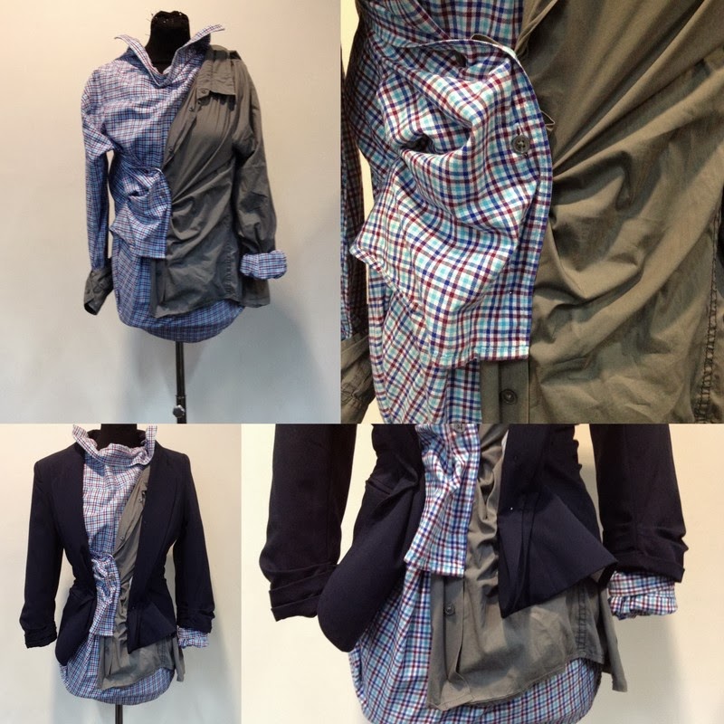
The third and fourth designs were my favourite, probably because I had gained more experience of working in this way. My third design comprises of a dark grey shirt worn upside down with the button panel folded to the left to create a new collar, I then attached a dark grey waistcoat to the waist line and added a few tucks/pleats to give the garment more detail. What I like about the garment overall is that the original detail in the original garments e.g. buttons, pockets, buckles and ties create new detail because of the way I've attached it to the mannequin. The last design I produced is made up of two mens shirts, the checked one is being worn backwards whilst the grey one is being worn the correct way. They are then joint together by the buttons, but they have been buttoned up alternatively to create a gathered detailing mainly in the centre and gradually widening, loosing less detail towards the exterior of the garment. I took a few pictured of the shirt modelled with a blazer to show how it could be worn as a fashion item as apposed to just a catwalk item. I am really satisfied with the outcomes of the last two experimental pieces, they remind me somewhat of Vivienne Westwood's work, rather than deconstructing the garment entirely, she gives the garment a whole new purpose.


Once we had finished  using whole garments to recreate new ones, we were asked to  dismantle each item by unpicking the seams, by doing this we could see the construction of each piece  and the necessary patterns that create them. To the left is a photographic demonstration of the dismantling of a blazer. Seeing the garment as a flat plan really helped  me to imagine how I could  incorporate different aspects of  the piece into other  garments. Another positive to this task was being able to see the inside of the blazer and the reverse material that is used, it gave me an idea to reverse the clothing as well as reconstructing it in a completely different way. 

Below are some examples of quick design ideas I had. I decided my ideas would be a lot more interesting and unconventional if I challenged my preconceptions of specific garments, for example; instead of aiming to create a dress or a top, I began to randomly place my cut up pieces of fabric to the mannequin and see where it led me. I found that starting around the neck area and slowly moving down to the shoulders is a great starting point to creating a garment… Below are some examples of draping neck pieces I came up with, that could easily be turned into a full article of clothing


Here you can see how my grey knitted neckpiece evolved from a high neck, frilled item to a tight fitting dress/top with pleats and ruches in flattering places. I have also recorded some detailing in the back of the garment for future reference - if i decide to actually make this garment wearable. I am pleased with this idea, because it looks almost finished and i have considered every aspect of the garment e.g. arm holes, neck line, back etc.. whereas in the other tasks i focused on making it look more interesting than wearable.


Still experimenting with ruches and gathers I have created a new design, but  only using simple t-shirt material. The contrast between the washed out striped t-shirt and the bold dark blue creates some really strong patterns and detailing where they meet or cross over. I thought I was only making things for the top half of the body, so attempted adding in something for the bottom half, which is again just a plain white t-shirt. I wasn't overly pleased with the results so I added in some more detail, like a zip and a shirts cuff, the piece evolved nicely but didn't produce my best results.


It was time to start modelling the garments as they should be used, so with great difficulty I started to recreate some of the work i had produced on a mannequin on a friend of mine. The design ideas didn't always appear as good on the human model as they did on the mannequin but it helped me to readjust ideas I initially had in order for them to work. I also started to think about accessories, below you can see how I have used a unattached collar in two different ways; around the throat and wrapped around the wrist.


Lastly are my two most favourable outcomes of the unstitching to recreate task. The first image shows a blue pleated, waterfall like skirt made from a navy blue blazer with interesting blazer detailing in unusual places. The skirt is accompanied by two different styles of top, the first shows a grey knitted, turtle neck vest top with appropriate pleating to mirror the skirts details and a similarly styled shirt with a  billowed appearance. The shirt was placed carelessly on the mannequin to begin with so that no one would steal it while I was out on lunch, but it accidentally turned into a useful mistake. The second design you can see, is a development of the grey dress I produced previously, it shows more detailing and an improvement of materials, I have also incorporated shirt lapels, cuffs and buttons to give it more character. 


12 Days Of Christmas

Over the Christmas holidays we were set a project which was to tell a story of our christmas using 12 images or 12 fifteen second "instagram style" videos. The idea of using 12 different images that represented our Christmas came from the song "12 days of Christmas", I knew that most people would take an obvious approach to this title and invent different ways of recreating each day of the song through imagery, but I thought that doing something like this will come across as too contrived and obvious. I decided it would be a good idea to carry my camera around with me over the Christmas period and just capture things i found interesting. So this is what i did, and on day one i came across a house covered from top to bottom in christmas lights, the lights were extremely cheesy, contrived and  tacky. Although I initially set out to photograph non-cheesy elements of Christmas, I discovered that the fun and fantasy of Christmas  lies in the  bright lights  that celebrate it.


After discovering the brilliance of tacky christmas lights I decided to give my project a point of direction so that it wouldn't wander off pointlessly. I then started looking closely at lighting around this time of year, recognising that everything was lit up brightly and beautifully, whether it be tacky or not. The images grouped together above  show different aspects of lighting that coincide with the theme of Christmas; winters sun, fairy lights, candles, shop displays etc… I tried to vary up the way in which I captured the lighting e.g. shadows, blurred light, close ups etc.. I did this so that each image was completely different from the last, I thought this was an important concept to keep throughout my work, so that each image represented something completely different, capturing my Christmas  experience as realistically as possible .

Independent Styling Shoot

Over the christmas holidays me and my friend decided to produce another styling shoot together, the "inspiration travels from overseas from the masters of minimalism in design, Scandinavia". In this shoot the aim was to capture the innovative, distinctive and bold ready to wear shapes, whilst keeping a minimalistic touch. I decided that a neutral backdrop would work well for this shoot and I knew a renovated pub at the end of my road that would be perfect… The neutral grey tone of the pubs exterior was muted and soft which contrasted really well with the prominent, sharp visuals of the clothing. 
Another aim for this shoot was to promote the clothing and accessories worn by the model in a fun and inventive way, it was agreed that we needed a full body shot to really capture the essence of the outfit and close ups on the two major accessories; Vagabond shoes and Acne bag. A composition that couldn't of worked better even if we tried was the depiction of the Vagabond shoes with the colour coordinated cat perched perfectly next to her feet… This shot was a perfect way of portraying fashion in a unique and dynamic way, I am really pleased with the results and I have decided that I will try and incorporate more quirky responses (like the cat) without making the images look to contrived. 

Monday, January 6, 2014

Editorial Shoot Inspired by Fashion Galore At Somerset House and Dazed&Confused


Fashion Galore - Isabella Blow


"Photograph of Self portrait on napkin, by Isabella Blow"
Fashion Galore at Somerset house show cases the life and inspirations of the late Isabella Blow. From the discovery of major style icons Phillip Treacy and Alexander McQueen to the relics of an old family estate which greatly influenced the majority of her work. Blow had a "traditionally edwardian" childhood, with parents who were high society, glamorous and mysterious, yet the exhibition reveals that her upbringing was decidedly unglamorous. Though her family had money for generations, her gambling grandfather lost most of it. When Isabella’s father died, she and her sisters were left only £5000 each. Isabella inherited her grandfather’s careless ways, and spent far too much on things she could never afford: a “very Bond” silver BMW, the most expensive hotel rooms in the world, and, of course, clothes—an infinite variety of clothes, many of which, “no matter how expensive, would frequently end up on the floor, ripped and covered in stains.” After working menial jobs around London, she gained entry into the fashion world by interning for Anna Wintour at US Vogue.


"Photograph of shoes from exhibition, shoes by FrizonMaud,"
The exhibition is retrospective, nonetheless Blow's fearless, eccentric, provocative, humorous and almost impossible to miss style shines through with vigour. Exhibited, are selected garments from her very own wardrobe as well as memoirs disguised as jigsaws, piecing every aspect of her life together. Here show's an odd pair of Maud Frizon shoes worn by Blow, as she was soon promoted to stylist at VOGUE, working on fashion shoots by day and partying at night, she was spotted by Andy Warhol at a gathering wearing this pair of mismatched shoes… And the rest is history !

Then, in 1992, Isabella's attention was caught by another young designer; Alexander McQueen. She bought his postgraduate collection for ₤5,000 (which was paid in weekly instalments of ₤100 and delivered in bin bags) and set McQueen up in the same London flat so she could nurture him, too. By this time, she was working at British Vogue where she championed other up-and-coming designers, like Julien Macdonald, Hussein Chalayan and John Galliano. She also helped launch the modelling careers of Honor Fraser, Stella Tennant and Sophie Dahl
"SS/08 Collection, La Dame Bleue Phillip Treacy for Alexander McQueen."
Blow married at Gloucester Cathedral in 1989, dressed in a velvet gown and a gold headdress designed by Philip Treacy… This is when she discovered the Irish milliners talents. She offered him his own flat in London to design hats and would personally advertise his designs wherever she went, rarely leaving the house without one of his masterpieces placed on her head. "I'm a walking billboard," she declared. "That's my pleasure." Later in 1992, Isabella’s attention was drawn to another young designer; Alexander McQueen. She set McQueen up in the same London flat after purchasing his postgraduate collection for £5,000. - which she couldn’t actually afford, so she payed him in £100 instalments every week - And soon enough she was the middle man of his sale to Gucci, creating his own label there.

Taking inspiration from the exhibition we were asked to create and shoot a three page editorial using clothing which is currently available on the high street for a style magazine of our choice. The final editorial had to represent our chosen masthead as much as possible, we had to consider everything from type face to layout and imagery to fashion. I started by taking inspiration from the Fashion Galore exhibition and creating some mood boards based on the work produced by blow that I was most fascinated by. At first I felt slightly daunted by the brief, because Blow is such a fashion legend with a completely unique style, but as i started to combine my initial inspiration with a renowned magazine masthead, ideas started to piece together naturally.


The Collage of images above [from left to right] show photo shoots produced by Blow and editorial photo shoots I found in the magazine Dazed&Confused. The shoot "London Babes" styled and produced by Isabella, with models Honor Fraser, Bella Freud, Plum Sykes, and Stella Tennant evokes a sense of sassiness. The realness and casual nature of the photo shoot make the images personal and easier as an audience to relate to, the images do not just "celebrate" the clothes trying to be promoted but the lifestyle that the clothes live by. I found some images in the magazine Dazed&Confused that also depicted a believable concept, the images seem unedited and genuine which i personally think is more effective than staged imagery.


This set of images show the eccentric side of Blow's exhibition that I wanted to include in my editorial, and the more achievable option to portraying this. I took great interest in all the headwear designed by Phillip Treacy that was exhibited, but not having any skill in making headwear or many interesting materials to work with in under a week, I decided to simplify and merge the designs into a more practical idea - HAIRSTYLES ! 
On the left I have created a concept board which demonstrates how I would like the hair and makeup to look in my editorial shoot… Bold, eccentric hair styles with subtle, understated makeup. The hair will relate strongly to Blows dreamy, unconventional style, whilst the makeup will stay natural and realistic in order to stay relevant to my audience.

In order to remain fashion conscious and be current and up to date I referred bak to the trustworthy fashion forecasting website, WGSN. Here I found next seasons trends: trapeze-shaped coats, sportswear, oversized boxy t-shirts etc… With all this information I felt ready to start collecting clothes and choose my models… 

Burberry Industry


We have currently started a new project called 'Industry.' The aim of the project is to examine connections between our own work and that of other related practitioners. The supposed outcome of the project is to produce work that is relevant to our chosen practice that can be used in our portfolios, and to encourage research and understanding of the industry that we wish to work, in my case i will focus on the promotion side of things.


 We were put into groups of 8 depending of what position and what designer label we decided to work with and initially were asked to interpret some given quotes and use them as a starting point for the creation of a design/promotion concept. We were asked to imagine that the whole design and promotion team of our brand had fallen horribly ill weeks before a massive fashion show, and we were being held responsible to promote and design the new AW14 collection.


                      "There are massive gaps in this essay
                                 It is broken and rewound 
                               Not always knowing and yet searching 
                        Respond 
                       Exchange 
                   Converse
                                           Be a traveler in this novel even if only for a while"

My team is working for Burberry and comprises of 4 fashion promotion students and 4 fashion and textile students which i feel is an equal balance to work with. We started by interpreting the quote and depicting meanings and messages from it that could be linked to our show, and here is what we came up with…


 "Author's own,Group MindMap"
When brainstorming as a group:
- we came up with the concepts of travel, protection and decay, barring in mind that Burberry is a slick, swerve and prestige brand. We decided as a group that it would be appropriate to demonstrate the theme of decay through the promotional aspect of things to maintain Burberry's signature look.  
With further research and delving deeper into historical reference and themes, we discovered new concepts that would improve our original ones, keeping a continual theme throughout that tells a story. 
We discovered that in 1911 Burberry became the outfitters for Roald Amundsen, the first man to reach the South Pole, and Ernest Shackleton, who led a 1914 expedition to cross Antarctica. A Burberry gabardine jacket was worn by George Mallory on his ill-fated attempt on Mount Everest in 1924. 
In 1914, Burberry was commissioned by the War Office  to adapt its officer's coat to suit the conditions of contemporary warfare, resulting in the “trench coat”. After the war, the trench coat became popular with civilians. 
Based on the theme of travel we also discovered that in the 1940's Women would make garments out of silk maps that were used in WW2, this discovery was perfect for our design team because now they had an inspiration for a pattern that they could incorporate into our travel collection designs. 
Once we have discovered several really inspiring starting points we thought that it would be a good idea to start creating moos boards and concept boards to help inspire our design and promotional ideas. 
Our boards incorporate images that relate historically to Burberry but they also incorporate the idea of travel through maps and passport stamps.The aspect of time and decay are demonstrated through the images that we have used showing cracked paint, rusty clocks, the original 1800 London Burberry Store etc

 "Author's own, Independent concept board"
The colours that often appeared with decay were creams, whites, blacks and rusty oranges or reds, this inspired our leading design work colour schemes…