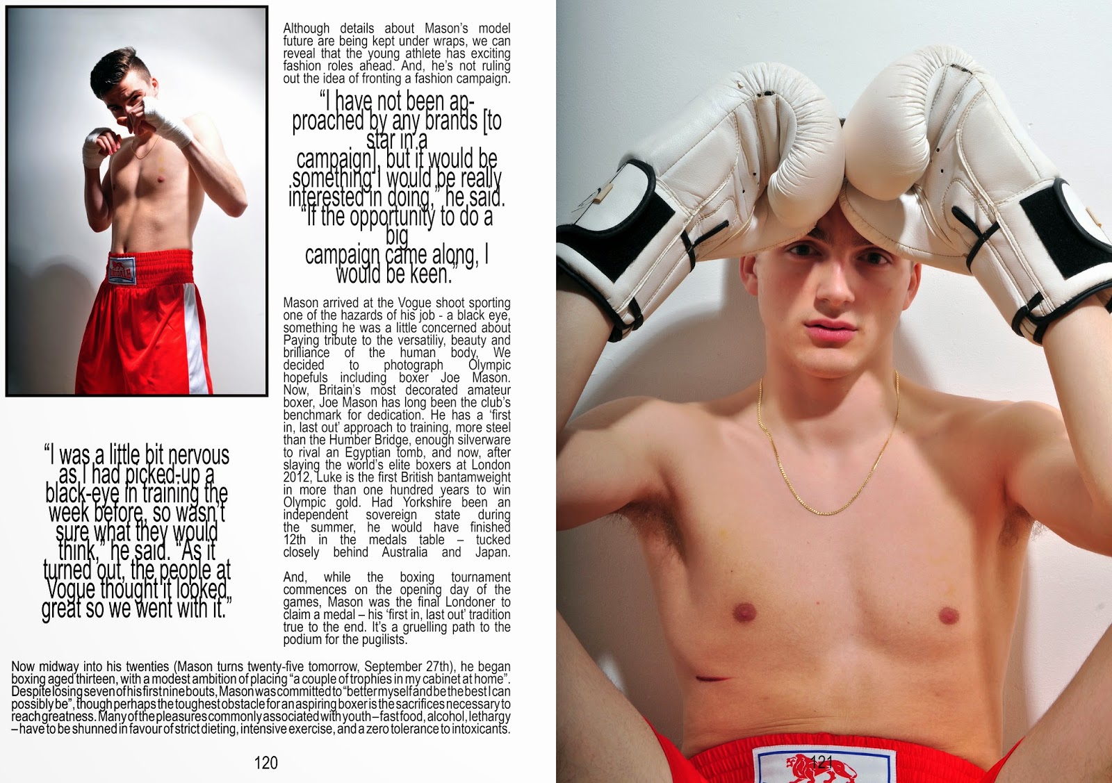
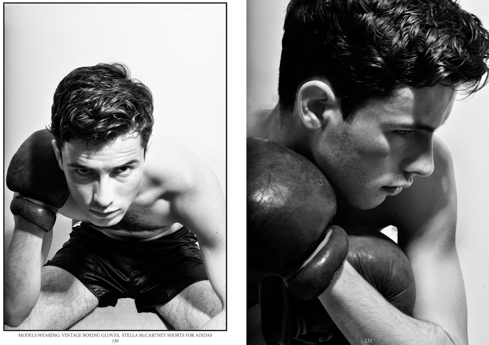
The two editorial shoots required a lot more thought than I expected. When writing my proposal I did start off with the ambition to create some sort of boxing themed editorial, but I wasn't sure how I could make it fashion based. Coming across Luke Campbell's VOGUE story inspired me to create something similar. As my initial idea was to demonstrate and challenge peoples pre conceptions of fighters,I thought it would be perfect to play on the idea of a "pretty" boxer. Casting the model for this shoot was difficult, I wanted someone who didn't have the obvious boxers broken nose but someone who still had an element of aggression and intensity In their eyes. The model I ended up using did work really well for the plan I started with, he has a few scars on his face which brings the element of fighting into it, but he also has very good cheek and brow bone structures, which ties in the model element I was looking for. A problem I faced with this shoot is choosing what to do with it and how to display it, I already had a masthead in mind [Complex magazine] that I wanted to base it on but I wasn't entirely sure about layout and purpose. With a little more research into Luke Campbell's debut as a model for select, I came across many interviews accompanied by photo shoots (not all fashion based). It became obvious that this shoot would be perfect as an interview/feature editorial, so I started to plan out a layout that could accompany text, it was all going smoothly and to plan, but then I realised I would have to find text to go with it. The more appropriate option would have been to create my own interview with a boxer [but my model was just an ordinary boy, not a boxer]. In the end I just decided to piece together snippets from Luke Campbell's existing interviews and change the name. Although this sounds like a cheaters way out, I am more focused on the creative and visual side of editorial spreads and not journalism. As for the second photoshoot, I already had a model in mind. I wanted someone that looked the complete opposite to a boxer, pretty, well groomed and slim. With his experience of modelling the shots were perfect, they related to boxing through the styling, but the style of the magazine was perfectly demonstrated through his professional understanding of modelling. This shoot is probably the best and easiest I have done so far. The poses are fierce but at the same time beautiful, and this is exactly what I was hopping for.
23rdApril2014


No comments:
Post a Comment