26thMay2014
 |
| (Authors Own, Steps demonstrating how I achieved my final film) |

(Authors own, Final Film contrasting Boxing & Ballet)
Evaluation.
For the Final Major Project, we were required to gather together our skills, knowledge and understanding to carry out our own confirmatory study. We were responsible for managing our own learning and personal development that will ultimately enhance our creative and technical skills in our chosen subject area. We had to identify a series of personal project aims and creative objectives to achieve a final outcome. Being a self-directed project, it was vital that the chosen subject area was important and interesting enough to me to ensure continuous momentum and enthusiasm. With gradual progress and careful consideration, I believe I managed to achieve a well-rounded and thought provoking concept within the seven-week time frame. For my Final Major Project I decided to study the art of boxing. With a personal family link to this contact profession, I thought it would be a fantastic opportunity to explore and document the lifestyle and atmosphere created around it.
Boxing was extremely popular around the early 20th century - especially in the east end of London, but the sport had become much less so by the late 1960's by the peace and love protests against the Vietnam war. Current media attention such as the London Olympic games 2012 has helped to bring boxing back to its original admired status, and thanks to the likes of Nicola Adams receiving a gold medal for Great Britain, the sport has caught the attention of a new generation of men and women, who are discovering that boxing has little to do with violence and everything to do with a search for self-knowledge. The majority of people will argue that boxing is a dominantly male sport, which requires aggression and strength, but this is not the case. My project started to develop with the idea that the art of boxing obviously requires a lot of skill and stamina, but the secret behind the profession lies in agility and balance, self-discipline and motivation.
I have always been interested in the idea of comparing and contrasting two contradictory concepts. I feel that this notion always produces really interesting visuals. At the primary stage of this project, I began with concept boards and collages and at first they didn't seem to make any sense or show my intention. I felt unsure of where my project would take me, but this collage making process is what eventually motivated my final piece. When creating a collage of collected newspaper clippings on Adobe Photoshop, I accidentally reduced the opacity in one of the layers, creating a combination of overlapping text and images merging into one. There was very little skill involved in this process as it happened completely by accident, but the product of my accident now enabled my sporty project to evolve into something a lot more interesting and experimental. Recording this observation in a note-taking sketchbook, I moved onto comparing and contrasting boxing fashion from early 1960's to the current day. I acquired the information to create these trend reports from the newspaper clippings my family had collected over the years, and current boxing journals and magazines such as "Boxing News" and "The Ring".
I then started looking at documenting the life of boxing in detail. I researched a few photographers like Daron Bailey and Sebastian Enriquez, who have touched on photographing and documenting boxers, but I also gained inspiration from general photographers such as Adde Adesokan who is a German street photographer. I had initially planned to produce stylised photography at Repton Boxing Gym in Bethnal Green, due to its prestigious reputation as a boxing club and its amazing historical visuals. Unfortunately, because of its renowned popularity, it has become increasingly difficult to access the gym for creative pursuits and would only be available at a considerable financial cost. I initially regarded this as a major set back as I had prepared lots of ideas to generate shoots at the club. I was determined, however, not to allow this set back to interrupt my creative flow, so I started to watch boxing related movies and search the Internet for inspiration for my film. Youtube was a main stimulus source, allowing me to access interviews, unseen movie clips, and old footage that included my own family connections. While scanning Youtube I came across an interview with amateur boxer, Philip Bowes who represents Repton Boxing Club. I searched Bowes name on the Internet and contacted him via Twitter, only to discover that he had now become professional and was no longer boxing for Repton. Although I had planned on using him as a way into the club, I put the contact to good use and asked if I could come along to one of his training sessions. He was happy to help, and invited me to film one of his training sessions at Street-Wise Boxing gym in Loughton. On arrival I intended to shoot video footage only, but the atmosphere motivated me to represent the surroundings more conceptually through the medium of photography. I was thrilled with the results produced from the visit, I obtained several shoots and gathered enough video footage to start putting together a short film.
As a designer and creator, I am motivated by trying new things, so making a film to capture the art of boxing, was perfect for my final project. The main focus of making a penultimate mini-film, was for me to have an understanding of equipment and editing software. I felt that this learning curve was compulsory to producing a final film of a satisfactory standard. Having quite a high standard of skills using Adobe creative suite, made it a lot easier for me to understand the editing program Adobe Premier Pro. Although I was not entirely satisfied with the final outcome of this film, it wasn't completely useless as I collected footage that was eventually to be used in the final film. I felt that the film was not conceptual enough for a final piece, as clips were repetitive and sometimes ran for too long. I did, however, think it would work really well for an Adidas logo (mostly present throughout) or a promotional boxing advertisement. I then noticed a billboard in the street featuring an album cover of the band "Warpaint." The image depicted was interestingly difficult to define due to an overlapping effect and I thought that the imagery created was elegant and feminine and echoed some of my primary research of overlapping transparency. It provoked ideas of an alternative photo shoot and I started looking at the two artists Nir ArielI and Ho-Ryon Lee, who also both create beautiful overlapping imagery. Both artists work depict angelic figures with a contradictory sense of structured chaos. The sensation of uncertainty that the images produced interested me and eventually led to my creating something completely abstract. It became my intention to capture movement in one photographic composition.
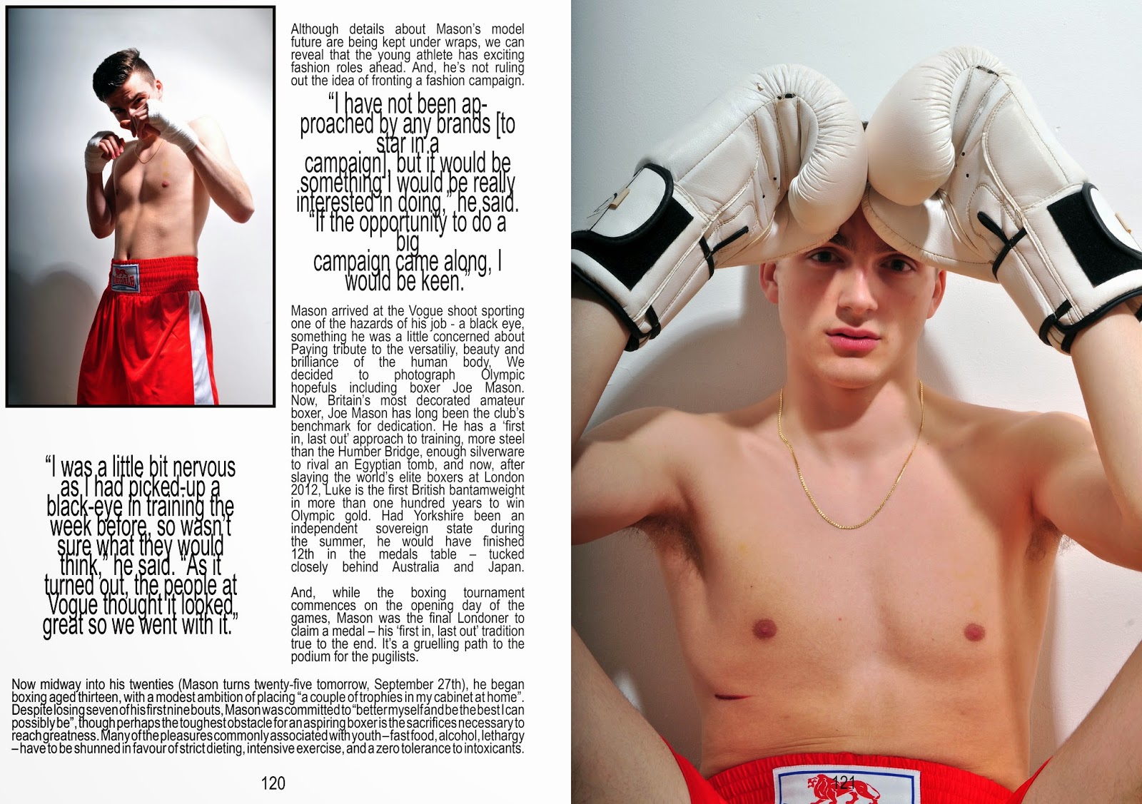
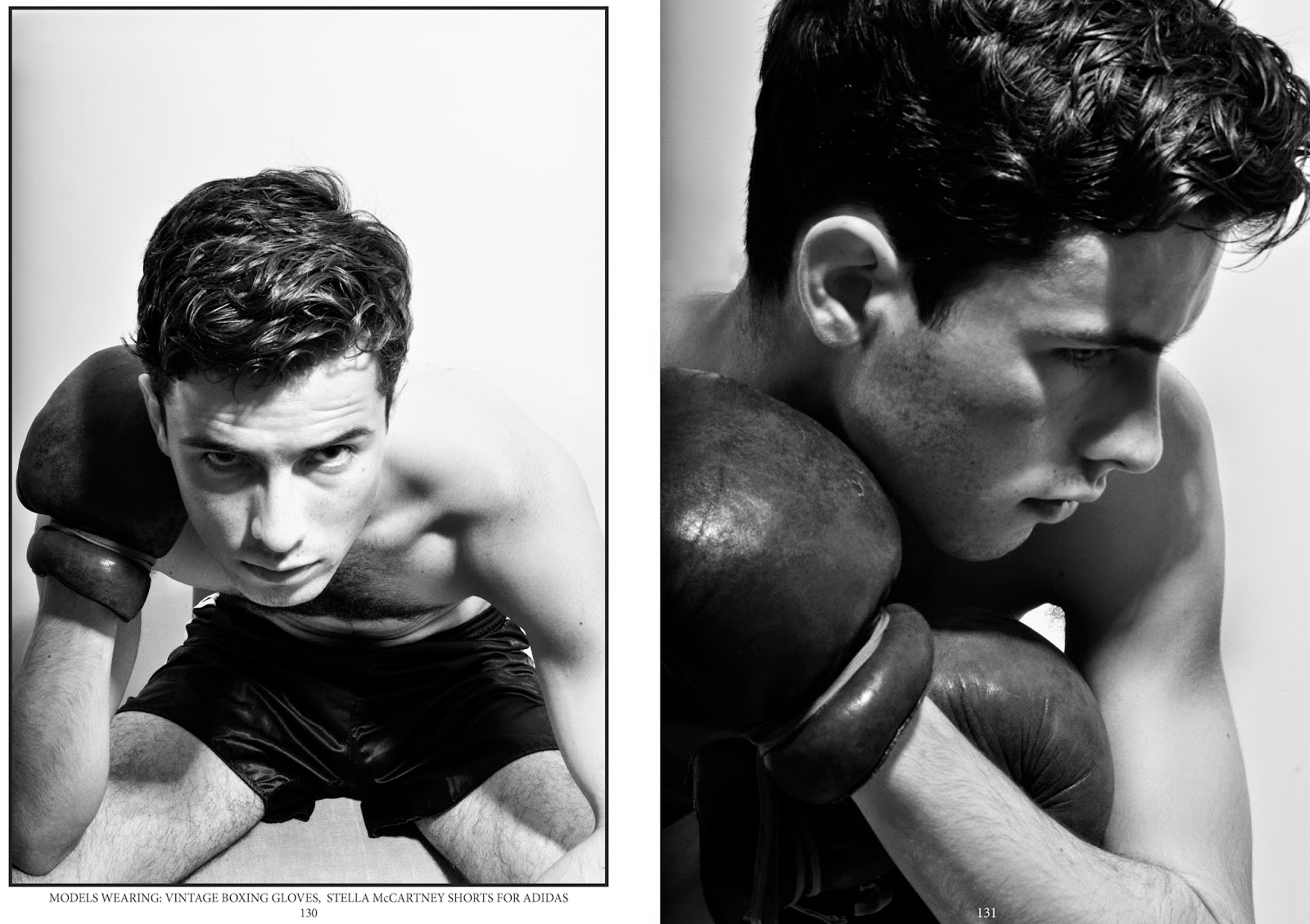
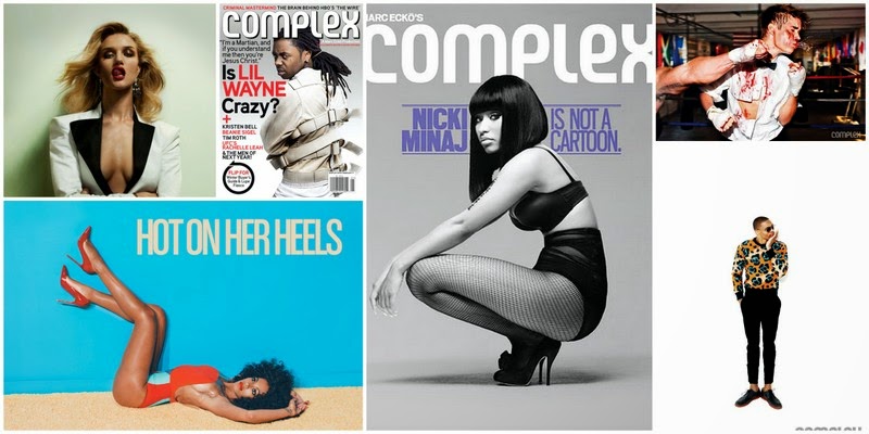
After experimenting with many different methods of presenting interesting visuals, I also decided that a mandatory subject to cover would be to create a fashion editorial shoot. I wanted the outcome of the editorial shoot to be clean and natural, unlike the images I had produced before. Boxer, and Olympic 2012 Gold Medalist, Luke Campbell was a big inspiration for this body of work. The images produced prior to him being scouted for Select model agency was perfect and exactly what I was looking for, for inspiration. As my initial idea was to demonstrate and challenge people's pre-conceptions of fighters, I thought it would be perfect to play with the idea of a "pretty" boxer. I wanted to produce an interview or style editorial but my model was not a real boxer so I just decided to piece together snippets from Luke Campbell's existing interviews and change the name. I am more focused on the creative and visual side of editorial spreads and not journalism, so I wasn't too worried that my 'interview' piece was not genuine. The two editorial shoots produced turned out exactly as planned, they were slick, informative and accompanied by carefully selected layouts and styles. I feel that these two shoots successfully represent my initial proposal idea of contrast.
I continued to portray the concept of boxing, movement and elegance all in one composition, and in order to produce these final images I had to take around 100 photographs of a single movement e.g. skipping or punching… Potentially I wanted to capture one movement at different angles, but each photograph seemed to capture the same position every time. Embarrassingly, to resolve this problem I had to ask my model to slowly skip one at a time and I would then try to calculate by eye when I would have to release the shutter button next. This was an extremely slow process but the results produced were definitely worth the effort. Once I had collected all the photos I needed, I transferred my images into one document on Adobe Photoshop and simply altered the opacity of each layer until I was satisfied. The final result of this experimentation had a subtle dance element to it and I realised that boxers and ballet dancers both require the stamina, agility, grace and self-discipline to perform successfully. I watched the film Billy Elliot and the idea of a would be boxer becoming a beautiful dancer appealed to me and as a result I produced the shoot that was to result in my final imagery. The connection with dance was vital to my final piece and enabled me to create multiple photo shoots, designs for advertising campaigns and ideas for producing a new film.
For my final imagery, I thought of combining the two ideas of dance and boxing by creating a 3D image that had an element of sculpture and projection. Considering aesthetically pleasing ways of doing this, I began by printing my final imagery onto fabric. I thought of photographing the material and gathering it on top of the image, creating a second overlap. But then I came up with the idea of strategically pinning the fabric onto the image to create a more 3D, waterfall-like aesthetic, but this concept proved difficult to achieve. I mounted my image onto MDF board and placed my fabric over the top. Of course when lying down, the fabric has a very different quality to when lifted up horizontally. So after pinning my fabric down once, I had to then remove the pins, stand the board up and start again. I also photographed this progression of pinning the fabric to produce a simple GIF file that demonstrates the process. I continued with the idea of movement and still wanted to achieve a more three dimensional appearance. The Jean Paul Gaultier Exhibition at the Barbican had a major impact on how my project was finally concluded. At the start of the show, a series of mannequins dressed in Gaultier's dazzling apparel, had faces projected onto their heads, disconcertingly bringing the figures to life. Since creating my final imagery, visiting this exhibition gave me fantastic ideas of creating an extra dimension of movement. Although inspired by the moving projections of the exhibition, this idea proved to be too ambitious for the time I had left to achieve it. To demonstrate my idea I made a short film on Adobe Premier Pro showing the printed fabric blowing in the wind and overlapped with the still final image. After looking at the work of Mathew Stone, I incorporated this third dimension, and found an alternative use for the printed fabric. Although this forms part of the conclusion of my project, it has given me ideas of the possibilities and potential of showing imagery in the future.
Over the course of the Final Major Project, I have learnt how to think progressively and laterally with any idea and to create something aesthetic and intelligent. I feel that my extensive research gained strength and momentum because of my commitment and genuine interest in my self-directed study subject. I have been highly organised throughout and learned to over-come any obstacles by thinking outside the box, being pragmatic and not being deterred when something didn't work out according to plan. I was lucky enough to find Phillip Bowes and have access to a real gym but also planned and achieved the studio shoots as an alternative. I also contacted The Royal London School of Contemporary Dance but a visit there proved too difficult to organise so I had to use existing film clips. I did investigate any potential copyright issues and was advised that I could include this footage as long as it was used in a unique way and strictly for creative, but non-professional purposes. I used Billy Elliot and solo dance performers and edited them in with my own film to produce something conceptual and unique
Other than a few minor problems with creating the final presentation, I am really happy with the final outcome. I think that I have successfully achieved my initial idea of contrasting masculinity in boxing and the not so obvious feminine and elegant side to it. I have visualized this concept by producing sketchbook research, film, photography, and a book illustrating the Art of Boxing