Showing posts with label #Boxing. Show all posts

Monday, May 26, 2014

Final Major Project Evaluation

26thMay2014
(Authors Own, Steps demonstrating how I achieved my final film)
                             (Authors own, Final Film contrasting Boxing & Ballet)


Evaluation.
For the Final Major Project, we were required to gather together our skills, knowledge and understanding to carry out our own confirmatory study. We were responsible for managing our own learning and personal development that will ultimately enhance our creative and technical skills in our chosen subject area. We had to identify a series of personal project aims and creative objectives to achieve a final outcome. Being a self-directed project, it was vital that the chosen subject area was important and interesting enough to me to ensure continuous momentum and enthusiasm. With gradual progress and careful consideration, I believe I managed to achieve a well-rounded and thought provoking concept within the seven-week time frame. For my Final Major Project I decided to study the art of boxing. With a personal family link to this contact profession, I thought it would be a fantastic opportunity to explore and document the lifestyle and atmosphere created around it.
Boxing was extremely popular around the early 20th century - especially in the east end of London, but the sport had become much less so by the late 1960's by the peace and love protests against the Vietnam war. Current media attention such as the London Olympic games 2012 has helped to bring boxing back to its original admired status, and thanks to the likes of Nicola Adams receiving a gold medal for Great Britain, the sport has caught the attention of a new generation of men and women, who are discovering that boxing has little to do with violence and everything to do with a search for self-knowledge. The majority of people will argue that boxing is a dominantly male sport, which requires aggression and strength, but this is not the case. My project started to develop with the idea that the art of boxing obviously requires a lot of skill and stamina, but the secret behind the profession lies in agility and balance, self-discipline and motivation.
I have always been interested in the idea of comparing and contrasting two contradictory concepts. I feel that this notion always produces really interesting visuals. At the primary stage of this project, I began with concept boards and collages and at first they didn't seem to make any sense or show my intention. I felt unsure of where my project would take me, but this collage making process is what eventually motivated my final piece. When creating a collage of collected newspaper clippings on Adobe Photoshop, I accidentally reduced the opacity in one of the layers, creating a combination of overlapping text and images merging into one. There was very little skill involved in this process as it happened completely by accident, but the product of my accident now enabled my sporty project to evolve into something a lot more interesting and experimental. Recording this observation in a note-taking sketchbook, I moved onto comparing and contrasting boxing fashion from early 1960's to the current day. I acquired the information to create these trend reports from the newspaper clippings my family had collected over the years, and current boxing journals and magazines such as "Boxing News" and "The Ring".
I then started looking at documenting the life of boxing in detail. I researched a few photographers like Daron Bailey and Sebastian Enriquez, who have touched on photographing and documenting boxers, but I also gained inspiration from general photographers such as Adde Adesokan who is a German street photographer. I had initially planned to produce stylised photography at Repton Boxing Gym in Bethnal Green, due to its prestigious reputation as a boxing club and its amazing historical visuals. Unfortunately, because of its renowned popularity, it has become increasingly difficult to access the gym for creative pursuits and would only be available at a considerable financial cost. I initially regarded this as a major set back as I had prepared lots of ideas to generate shoots at the club. I was determined, however, not to allow this set back to interrupt my creative flow, so I started to watch boxing related movies and search the Internet for inspiration for my film. Youtube was a main stimulus source, allowing me to access interviews, unseen movie clips, and old footage that included my own family connections. While scanning Youtube I came across an interview with amateur boxer, Philip Bowes who represents Repton Boxing Club. I searched Bowes name on the Internet and contacted him via Twitter, only to discover that he had now become professional and was no longer boxing for Repton. Although I had planned on using him as a way into the club, I put the contact to good use and asked if I could come along to one of his training sessions. He was happy to help, and invited me to film one of his training sessions at Street-Wise Boxing gym in Loughton. On arrival I intended to shoot video footage only, but the atmosphere motivated me to represent the surroundings more conceptually through the medium of photography. I was thrilled with the results produced from the visit, I obtained several shoots and gathered enough video footage to start putting together a short film.
As a designer and creator, I am motivated by trying new things, so making a film to capture the art of boxing, was perfect for my final project. The main focus of making a penultimate mini-film, was for me to have an understanding of equipment and editing software. I felt that this learning curve was compulsory to producing a final film of a satisfactory standard. Having quite a high standard of skills using Adobe creative suite, made it a lot easier for me to understand the editing program Adobe Premier Pro. Although I was not entirely satisfied with the final outcome of this film, it wasn't completely useless as I collected footage that was eventually to be used in the final film. I felt that the film was not conceptual enough for a final piece, as clips were repetitive and sometimes ran for too long. I did, however, think it would work really well for an Adidas logo (mostly present throughout) or a promotional boxing advertisement. I then noticed a billboard in the street featuring an album cover of the band "Warpaint." The image depicted was interestingly difficult to define due to an overlapping effect and I thought that the imagery created was elegant and feminine and echoed some of my primary research of overlapping transparency. It provoked ideas of an alternative photo shoot and I started looking at the two artists Nir ArielI and Ho-Ryon Lee, who also both create beautiful overlapping imagery. Both artists work depict angelic figures with a contradictory sense of structured chaos. The sensation of uncertainty that the images produced interested me and eventually led to my creating something completely abstract. It became my intention to capture movement in one photographic composition.
After experimenting with many different methods of presenting interesting visuals, I also decided that a mandatory subject to cover would be to create a fashion editorial shoot. I wanted the outcome of the editorial shoot to be clean and natural, unlike the images I had produced before. Boxer, and Olympic 2012 Gold Medalist, Luke Campbell was a big inspiration for this body of work. The images produced prior to him being scouted for Select model agency was perfect and exactly what I was looking for, for inspiration. As my initial idea was to demonstrate and challenge people's pre-conceptions of fighters, I thought it would be perfect to play with the idea of a "pretty" boxer. I wanted to produce an interview or style editorial but my model was not a real boxer so I just decided to piece together snippets from Luke Campbell's existing interviews and change the name. I am more focused on the creative and visual side of editorial spreads and not journalism, so I wasn't too worried that my 'interview' piece was not genuine. The two editorial shoots produced turned out exactly as planned, they were slick, informative and accompanied by carefully selected layouts and styles. I feel that these two shoots successfully represent my initial proposal idea of contrast.
I continued to portray the concept of boxing, movement and elegance all in one composition, and in order to produce these final images I had to take around 100 photographs of a single movement e.g. skipping or punching… Potentially I wanted to capture one movement at different angles, but each photograph seemed to capture the same position every time. Embarrassingly, to resolve this problem I had to ask my model to slowly skip one at a time and I would then try to calculate by eye when I would have to release the shutter button next. This was an extremely slow process but the results produced were definitely worth the effort. Once I had collected all the photos I needed, I transferred my images into one document on Adobe Photoshop and simply altered the opacity of each layer until I was satisfied. The final result of this experimentation had a subtle dance element to it and I realised that boxers and ballet dancers both require the stamina, agility, grace and self-discipline to perform successfully. I watched the film Billy Elliot and the idea of a would be boxer becoming a beautiful dancer appealed to me and as a result I produced the shoot that was to result in my final imagery. The connection with dance was vital to my final piece and enabled me to create multiple photo shoots, designs for advertising campaigns and ideas for producing a new film.
For my final imagery, I thought of combining the two ideas of dance and boxing by creating a 3D image that had an element of sculpture and projection. Considering aesthetically pleasing ways of doing this, I began by printing my final imagery onto fabric. I thought of photographing the material and gathering it on top of the image, creating a second overlap. But then I came up with the idea of strategically pinning the fabric onto the image to create a more 3D, waterfall-like aesthetic, but this concept proved difficult to achieve. I mounted my image onto MDF board and placed my fabric over the top. Of course when lying down, the fabric has a very different quality to when lifted up horizontally. So after pinning my fabric down once, I had to then remove the pins, stand the board up and start again. I also photographed this progression of pinning the fabric to produce a simple GIF file that demonstrates the process. I continued with the idea of movement and still wanted to achieve a more three dimensional appearance. The Jean Paul Gaultier Exhibition at the Barbican had a major impact on how my project was finally concluded. At the start of the show, a series of mannequins dressed in Gaultier's dazzling apparel, had faces projected onto their heads, disconcertingly bringing the figures to life. Since creating my final imagery, visiting this exhibition gave me fantastic ideas of creating an extra dimension of movement. Although inspired by the moving projections of the exhibition, this idea proved to be too ambitious for the time I had left to achieve it. To demonstrate my idea I made a short film on Adobe Premier Pro showing the printed fabric blowing in the wind and overlapped with the still final image. After looking at the work of Mathew Stone, I incorporated this third dimension, and found an alternative use for the printed fabric. Although this forms part of the conclusion of my project, it has given me ideas of the possibilities and potential of showing imagery in the future.
Over the course of the Final Major Project, I have learnt how to think progressively and laterally with any idea and to create something aesthetic and intelligent. I feel that my extensive research gained strength and momentum because of my commitment and genuine interest in my self-directed study subject. I have been highly organised throughout and learned to over-come any obstacles by thinking outside the box, being pragmatic and not being deterred when something didn't work out according to plan. I was lucky enough to find Phillip Bowes and have access to a real gym but also planned and achieved the studio shoots as an alternative. I also contacted The Royal London School of Contemporary Dance but a visit there proved too difficult to organise so I had to use existing film clips. I did investigate any potential copyright issues and was advised that I could include this footage as long as it was used in a unique way and strictly for creative, but non-professional purposes. I used Billy Elliot and solo dance performers and edited them in with my own film to produce something conceptual and unique
Other than a few minor problems with creating the final presentation, I am really happy with the final outcome. I think that I have successfully achieved my initial idea of contrasting masculinity in boxing and the not so obvious feminine and elegant side to it. I have visualized this concept by producing  sketchbook research, film, photography, and a book illustrating the Art of Boxing

Friday, May 23, 2014

Final Presentation Ideas

21stMay2014
Matthew stone is an artist that I came across when researching magazine styles for my editorial shoot, I saw some of his photography demonstrated in Dazed and Confused magazine and found it really interesting. produces objects, photographs, exhibitions, performances and social events advancing the proposition, quoted in a gallery news release, that optimism is “the vital force that entangles itself with and then shapes the future.” His photographic-sculptural hybrids illustrate that thought literally. They consist of muted photographs of entangled, youthful, nude bodies printed on plywood panels, which have been cut into triangular sections, reassembled with hinges and displayed as folded constructions. Stone takes 2D images and translates them into “3D photographic sculptural forms”, He uses his prints in an unusual way by transferring them onto fabric and geometric sculptures. In his series of work that interests me greatly “Optimism as cultural rebellion” he demonstrates experimenting with abstracting the human form “I like the idea of trying to make something that has some solid ground, but then has the potential to move. I like the idea that it is almost impossible to re-install the work in exactly the same way.” 

(Imagery taken from art shaman blog, post about Matthew Stone, Series of work Optimism as cultural rebellion)

25thMay2014


I am really interested in displaying my work in an unconventional way so that the idea is turned into something completely different, I want my final piece to not only be beautiful, but I want it to intrigue people and have a thought provoking sense to it. Ive enquired about using a projector for my final piece, but it seems that my idea is too time consuming and ambitious for the time and space we have. Now that the projection idea isn't possible the combination of the projections and Stone's work seems more achievable. Before moving on to a final idea I tried experimenting with alternative ways of displaying some sort of projection. I filmed a piece of fabric on my washing line blowing in the wind. The fabric had an identical image of my final photography on it, so in order to demonstrate how the projection would look I edited the film and the still image together at a 50% opacity. The imagery and film works really beautifully together once slowed down, it has an angelic elegance to it. I initially used ballet music with the moving image but soon after realised it didn't have much relevance to my initial concept of contrast. In order to relate it to my work with more relevance I added a personal touch to it. I edited together snippets of  audio from one of John L Gardners fights. This soundtrack seemed to work much better in my opinion due to the obvious contrast between elegance and masculinity. It also added an obscure nature to the film, beautiful, floaty, angel-like imagery accompanied by the sounds of cheers and punches, which I think is a unconventional and  less obvious choice. Although the idea of projecting the moving fabric onto a still image is not possible for my final presentation, I am still really interested in capturing movement in one more dimension other than the overlapping photography. After looking at the work of Mathew Stone and adamant I incorporate this third dimension, I came up with an idea that could potentially work. I decided to put the fabric used in the film to good use. Instead of solely creating a sculpture or creating a projection of movement, I thought of combining the two ideas and creating a 3D image that had an element of sculpture and projection. I began to think of aesthetically pleasing ways of doing this. I thought of photographing the material gathered on top of the image creating a second overlap. But then I came up with the idea of strategically pinning the fabric onto the image to create a more 3D, waterfall-like aesthetic. As you can probably imagine this concept proved difficult to achieve. I mounted my image onto MDF board and began to place my fabric over the top. Of course when lying down the fabric has a very different quality to when lifted up horizontally. So after pinning my fabric down once, I had to then remove the pins, stand the board up and start again. I managed to cover up the majority of the holes created by my first attempt. Other than a few minor problems with creating the final presentation, I am really happy with the final outcome. I think that it translates my initial idea of contrasting masculinity in boxing and the not so obvious feminine/elegant side to it.
                                                                                                                                                                                                                                                                                           (Authors Own, Small films representing idea for presentation) 

Tuesday, May 6, 2014

Editorial Research

19thApril2014
(Lindbergh, Peter. shoot for VOGUE, Model Luke Campbell)

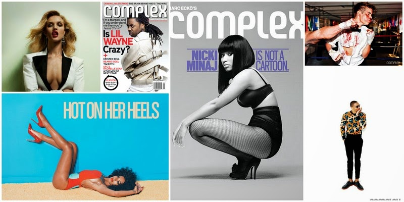
After experimenting with many different methods of presenting interesting visuals, I decided that a mandatory subject to cover would be to create a fashion editorial shoot. I wanted the outcome of the editorial shoot to be clean and natural, unlike the images I have produced previously. To start off this body of work I researched Boxing editorials and the first images to come up were ones of Luke Campbell, Olympic 2012 Gold Medalist who has recently been scouted for Select Model Agency. The images where perfect and exactly what I was looking for, for inspiration. I didn't want to copy these images so I continued to scour the internet for a combination of Boxing images, editorials and Ballet imagery. Once I had found a range of imagery I started to look at specific fashion magazines to base my shoots on. I discovered two called Sharp and Complex, which depict clean and uncontrived editorial shoots. 
(Complex magazine. Collection of covers and editorials)
(Authors own. Collection of imagery)


Complex is a New York-based bi-monthly magazine which reports on trends in fashion, music, art and design, technology, sports and video games with a focus of niche cultures such as street wear sneaker culture, hip-hop and graphic art.  I was quite interested in the way that they're photo shoots were set up, simple, stripped back and focusing on the subject entirely, accentuating character and personality. Unlike most of my previous work - which has been shot on location - I thought I'd experiment with some sleek and sharp studio style photography. I wanted to produce two photo shoots; one portraying more boxing related lifestyle and characteristics, and the other simply fashion based. Complex magazine did not meet the requirements of my second photo shoot concept, and this is when I came across Sharp magazine.

Sharp is a Canadian Men's lifestyle magazine which publicises style, cars, technology, food & drink, culture, street style, sport and up and coming events. The difference between Complex magazine and Sharp is the target audience. While Complex looks at the younger generation  - 16-29 years - and up and coming young talents, Sharp takes a more mature approach, depicting men in later life with established careers. Coming across this magazine has inspired me to take a new approach to my second shoot. Rather than having a typical-boxer-looking model, I think that it would strengthen my proposals initial concept to use a more feminine-fashion-like-model dressed in sportswear. 
The images shown on the right are ones that I have been collecting since the start of the project in a folder on my computer. When starting the project I knew I wanted to focus on boxing showing the male form and some how try to incorporate fashion into it, but I was completely blind to where I could take it. 
(Sharp magazine. Collection of covers and editorials)

Red Bull gives you wings Campaign

10thApril2014
(Red Bull advertisements)
The production of the short test film and initial photo shoots really inspired me to try and create something from scratch. I had already gained some inspiration from from the soundtrack used in my short film, focusing on the elegance of dancers, but researching deeper into this concept I decided to narrow the idea down to Ballet. Ballet  is a perfect contrast to Boxing, but the two opposing sports contrast mirroring stereotypes. Ballet is seen as gentle and feminine whereas boxing is often viewed and macho and brutal, but when delving deeper into the lifestyles the participants of each sport endure, the hidden side is revealed. Based on my proposal I started to look for clever advertising campaigns related to sport or more generally related to boxing. I came across loads of protein shake related campaigns, but one that really linked closely with my new idea of wings was the "Red Bull gives you wings" campaign. Producing something for Red Bull using my concept seems ideal.  Red Bulls international marketing campaign targets mostly young men partaking in extreme sports. The slogan "Red Bull gives you wings" is a metaphor of the fact that it gives you energy to tackle anything. Meaning that any task you attempt will be much easier since you feel like you have wings, increasing confidence. Alongside boxers much preferred strength product - protein shakes - I thought that creating my own Red Bull advertisement based on boxing would be perfect.

11thApril2014
(Authors Own, RedBull Illustration)


When looking at previous Red Bull advertisements I noticed that the majority of the imagery used were simple and cartoon-like with a hint of colour. I decided it would be appropriate to alter Red Bulls initial approach to illustration and create something a little more life-like to appeal to my target audience [Boxers / Athletes]. I started off by taking more photographs of male boxers in all the legitimate boxing gear, but with angel-like wings on. I then transferred these images into Adobe Illustrator, made a template and started to trace around the outline of the male model. In some cases the outline was really hard to make realistic due to the angle of the model, but with a bit of trial and error I came up with 3 final outlines for my final product. After I had finished with the imagery in Adobe Illustrator, I edited the wings in the original composition on Adobe Photoshop. I then brought the two images together to create a final illustration. I created a simple but  relevant logo and then started looking into finding an appropriate quote to go with it. After hours of locating the perfect words to suit my imagery, I came across 3 perfect boxing related quotes in the "Boxing News - Annual" magazine. Two of the quotes were by the legendary fighter Muhammad Ali and the other by famous novelist Joyce Carol Oats [who often wrote about boxing] 


I wanted the wings to maintain their light and feathery quality so I chose not to reproduce those in Adobe Illustrator. I did so in Adobe Photoshop, but finding the right filter proved extremely difficult. I had to carefully edit out the model and the white background -which was the trickiest part because of the identical colour of the wings and the background - and then really intensify the contrast of the remaining image, this helped to ensure all detail stood out. Following on from this, I had to continuously experiment with different filters and tones. Each set of wings for each of the three advertisements were actually produced in slightly differently, using the same filters and techniques but in a different order. The main filters used were the OIL COLOUR, STAMP and CRAQUELURE effects. I wanted the colouring to be just right, and to look natural and organic, so I've decided to print these samples out onto watercolour paper and experiment with painting onto them by hand rather than on a creative Adobe programme.


(Authors Own, RedBull Illustration)

Here are the examples of my ad-campaign "RedBull gives you wings" that have had watercolour incorporated into them. I am fairly happy with the finished product for this section, but cannot decide weather they look more sleek and stylish without the water colour. It took me a few attempts to get the water colour just how I had planned, due to my inexperience with watercolour paints. I wanted the colour to be sporadic and subtle. I decided to paint the gloves red - opposed to the white colour they demonstrate in the primary photography imagery - so that it stood out stronger as a boxing related advertisement rather than just another RedBull advert. Something that was really difficult during this process was getting the wings just right. I forgot to record how I achieved the final appearance of the first set of wings, and so the second and third set of wings did not match up. I had to start again and record how I got to the final outcome. Another difficulty was actually editing the wings. Because the images were taken on a white background it was hard to trace around the edges to cut them out because of the colour similarity. I had to be really careful to maintain the featherlike quality, something I'm not very happy with is the colour of the wings in the final prints. I wanted to print onto watercolour paper which is a creamier colour than ordinary photo paper, but the wings did not show up on this paper, so I had to make them slightly grey. Other than the slight issue with the wings I am happy with each individual image.
15thApril2014
(Authors Own, RedBull Illustration, worked into with watercolours)


Saturday, May 3, 2014

Photo Shoots & Editing

25thMarch2014
These are the final images produced from the overlapping inspired photo shoot. I feel that I have achieved exactly what I intended to, the imagery really speaks for itself, the concept of boxing, movement and elegance is all portrayed through one composition. In order to produce these final images I had to take about 100 photographs of a single movement e.g. skipping or punching… As simple as this may sound - clicking away while my model skips/punches - it certainly was not. I used a pop up studio for this shoot, which consisted of a flash and a soft box, so repeatedly clicking away at the shutter button will only deactivate the flash producing pitch black photos. Potentially I wanted capture the rope at different positions as it moved, but it seemed to be getting it at the same position every time.  Embarrassingly, to resolve this problem I had to ask my model to slowly do one skip at a time and I would then calculate by eye when I would have to release the shutter button. This was an extremely slow process but the results produced were definitely worth it. Once I had collected all the photos I needed, I transferred my images into one document on Adobe Photoshop and simply altered the opacity of each layer until I was satisfied.

(Authors Own, Experimenting with photoshop skills - Skipping&Boxing)

27thMarch2014
(Authors Own, Experimenting with photoshop skills - Masculine vs. Feminine)

Unlike the previous shoot this one proved to be much simpler due to the movements required. As I previously mentioned, dance is becoming a new inspiration for my project. Before the shoot I researched ballet poses by watching clips on youtube and googling images. I converted these ideas into a visual mood board to show my model and then I let him move freely while I photographed him. The casting for this particular model was easy, this is a friend of mine who previously attended gymnastic classes, his physique is slim but muscly, not too big and not too small. The poses that he was performing accentuated his muscles greatly which worked really well when creating the double exposure. The only difference concerning editing this shoot was that I felt the images needed more contrast, so that the shadows created by his muscles were accentuated. The positioning of the overlapping muscles reminded me of wings which motivated the next idea [see below]. I decided to really play on the idea of masculinity and femininity. So I then styled my model in all white boxing gear; white hand wraps, white boxing gloves and white shorts with a pair of handmade angel wings. The angel wings really exaggerate the feminine aspect of my idea, so to counter balance this I decided to super impose tattoos all over my models back and arms. I shot with and without wings. I am really happy with the results produced from this shoot, it spurted from a random creative visual and its transpired into another interesting visual. If I were to reproduce these images at any stage and build upon them, I think I'd give a lot more thought into tattoo design and placement, but for this idea I think its worked well.

2ndApril2014
(Authors Own, Experimenting with photoshop skills - Boxing vs. Ballet)

Sunday, April 6, 2014

Test Film

17thMarch2014
Following on from the previous post, this is the short film I produced in conjunction with the documentary style photography. Unfortunately the short film wasn't finished in time for the group crit, so I didn't have time to listen to my peers views and opinions on what I had achieved, nor did I have time to add in the ideas I was given. I am not entirely satisfied with the final outcome of this film, for example some of the clips run for too long and can be repetitive or boring, but the main focus when producing this film was to obtain skills to use equipment needed to produce a film e.g. Camera skills and practicing with editing software. The film hasn't been completely  useless due to the footage I have collected and the fact I have gained useful and transferable skills. As well as this I feel like the downfalls will help me choose what will work well together and what wont, and how long to preview certain clips for to keep my audience engaged. The film is not conceptual enough for a final piece but I think it would work really well for an Adidas [logo mostly present throughout] or a promotional boxing advertisement. Something perfect I can make use of from this film is the soundtrack I have chosen. It has a close connection to the boxing world as it has been used for many fighters 'big entrances' and used in many short boxing films. I think this part of my project has taught me the biggest lesson so far, and I am really happy that I have seen this process to the end this early on in
(Authors Own, Experimentation film - Learning how to use software and equipment)                             my project, because now I feel fully prepared and extremely excited to tackle the final film piece.


(Authors Own, Documenting Street-wise gym in Loughton)

First Photo Shoot at Street Wise Gym, Loughton

15thMarch2014
(Authors Own, Portraits of Boxers)

(Authors Own, Documenting Street-wise gym in Loughton)


This particular page demonstrates the images I produced on my visit to Street-Wise gym in Loughton. On arrival I aimed to only capture footage for a short film, but when I had finished up with the filming a member of the gym asked me to take a picture of him posing with a fellow fighter "Phillip Bowes" [who I filmed]. I was initially determined to produce my documentary style images in an old fahsioned, vintage gym e.g. Repton Boxing Gym in Bethnal Green, so that my compositions echoed character and history that is often associated with boxing. When I was actually there, in the thick of all the testosterone, sweat and grunts, the atmosphere alone created a perfect environment for me to shoot. This sparked a spontaneous idea so I had to think fast about the sort of outcomes I had planed, combined with having to adapt my initial ideas to suit the new location. Unprepared and not very confident I continued to take these "typical" after fight shots of some of the guys. Following on from this I asked a few more members if it would be ok for me to take some simple portraits of them. Some were confident and happy to help, while others were not so sure, but with a bit of persuasion I managed to capture some really beautiful high contrast, black and white images. The compositions are simple head shots with complementing backgrounds, which have been edited in Adobe Photoshop so that the focus is on the individual with a subtle hint of boxing in the background to confirm the meaning of the shoot. The other images have the same impression as the portraits, but unlike the portraits, these images are less contrived with no posing at all. I just observed some of the things going on in the gym, such as training, sparing, resting, equipment etc and documented it as everything was happening around me. I am really happy with both sets of imagery I have produced. Although it wasn't what I had originally set out to do, I feel that I have exceeded my first idea by creating an atmosphere of adventure, experience and history purely through the use of photography, and carefully selected compositions.  

Following on from this photo shoot was another peer crit session. This time there were different people in my group which meant I acquired different and unique responses and ideas, this is always useful to me because I think I learn best when I analyse other peoples work and vise-verse. I raised the point based upon my own work that I wasn't entirely happy about the way in which my project was moving in. I thought it was too sport based and there weren't enough conceptual, interesting, thought provoking ideas incorporated within in the work. I proposed the visualization of contrasting the conflicting practice of Dance with Boxing. Not everyone was keen on the idea, but I was given loads of great ideas that I could use in my work. For example someone suggested comparing and contrasting the different between street fighting / judo with boxing, another suggestion was child boxing / women's boxing with male boxing. I personally thought that contrasting another fight based sport or opposite sex boxing was still too sport based and this isn't what I was really aiming for. I still considered some of the ideas I was given, but im also interesting to explore the idea of dance.
(Authors Own, Documenting Street-wise gym in Loughton)


(Authors Own, Documenting Street-wise gym in Loughton)

Saturday, April 5, 2014

Primary Research & Trend Reports

20thFebruary2014


l have kick started my project by looking through collected newspaper clippings and saved tickets/programmes and putting them together in an aesthetically pleasing way. I started off this way because I was unclear where I wanted to actually start, creating something visual pleasing can often influence ideas. When looking at the collages I made from the clippings its obvious at first glance that the fashion and digital graphics used are very different from what we have today. Advertisements of fights are very basic, using only black and red ink and showing stereotypical aggressive portrayals of both fighters. Advertisements today are a lot bolder, with the amazing technology that is available to us we are able to create emotive pieces of art work. An example shown on the right experiments with interesting typography to create a fitting atmosphere, whereas the examples on the left show simplistic boxy typography. Another difference lies in the imagery used, in the poster for Mayweather and Pacquiao there is an electric storm or or star exploding behind both of they're perfectly molded bodies. Again the 80's references just keep it simple due to the lack of technology. I think its good to look at the different generation of design aspects because the recourse could definitely inspire future work of mine throughout this subject area.


Creating collages out of the old newspaper clippings did seem pointless at first, and I felt I was wasting my time trying to fill my sketch book with work. Although at first it seemed pointless it has fueled ideas of my own based on styling, typography, layout, photography style and headings or slogans that could help create names for pieces I will create. Whilst putting the copies of the clippings into one aesthetically pleasing document on photoshop I accidentally set the transparency of one of the images to 50% and I really liked the results that this produced. The text and imagery combined worked really we together. Although its nothing worth presenting, this accidental outcome has helped me to think outside the box, and plan for future work.


(Authors Own, Collected Imagery Scanned in)
I then created a general mood board surrounding the area of boxing, including fashion imagery, documentary style photography, tickets, newspaper clippings etc… I thought that by starting with a very broad understanding of the sport I could then begin to branch off into more specific, personal aspects and transform it into something creative. After gathering imagery I started to look at the more personal elements of my project - Family. My family have a strong link with the sport, and much memorabilia has been collected over the years. My Aunties ex-husband was the European Heavyweight Champion of the 1980's - John L Gardner - which has left me with loads of amazing primary sources that will help me to produce some really strong work in the coming weeks.2ndMarch2014
(Authors Own, Collage of Imagery found on google and personal collection)
5thMarch2014

When creating the mood board, something that really fascinated me was the obvious change in fashion. Most of my images are from the 1980's or the current 2014 period, and the drastic transformation from simplistic to glitzy and contrived sportswear is very obvious. It seems that in the 1980's things were fairly plain with iconically "masculine" / "manly" colours [Red, Blue, Black] whereas now, things seem to have derived from this idea of masculinity and moved onto the idea of fame and glamour. Below shows a series of trend reports that I created that compare the fashion of boxing in the 80's to the fashions of today. To me the results are very different and the contrast is apparent in many mediums, from materials used, fit of sportswear, colour etc… 

(Authors Own, Trend Report)
To begin with I compared the trends and fashion of the two well known boxers George Groves [2014] and Muhammad Ali [1980]. This comparison is not obvious at first, the colours remain fairly simple in both, sticking to classic blue and red, but there are really important differences in the fabrication of the sportswear. When looking at the length of the shorts it is apparent that in the 80's the design was a lot shorter than todays current design, this is just due to what was considered fashionable at the time. The high wasted design of the shorts acts as a guideline so that the opponent cannot "hit bellow the belt" - a rule in boxing is that boxers shorts must be raised so the opponent is not allowed to hit to the groin area with intent to cause pain or injury. A major change in "uniform" is the mouthguard, not only has it become easily customised, but the fabric has been improved for durability, comfort and protection. Initially they were manufactured from impressions using wax, rubber and steel springs were even recommended to reinforce soft materials. Subsequently they were drastically improved by a dentist who used a transparent acrylic resin to form what he termed an "acrylic splint". It was moulded to fit unobtrusively over the upper or lower teeth, it also meant that the athlete could talk in a normal manner while the mouth guard was in place. Now days the technology of material knowledge and manipulation has improved greatly and a simple thermo-plastic material manufactured in a pre-formed shape in various sizes can be adapted to fit more closely to an individual's teeth and gums by heating and moulding such as boiling then placing in the mouth.
(Authors Own, Trend Report)
Here I have compared the trends of the two boxers John L. Gardner [1980] and Phillip Bowes [2014]. With this contrasting trend report it is a lot more evident that fashion has changed, not only has the fabrication and fit of the sportswear improved drastically, but the colours and style have become more radical and eccentric. Despite being east London born and bred Bowes took the unusual decision to represent Jamaica at the Commonwealth Games. The fighter felt the only way he could pursue his dream of reaching the top of his game would be to swap the English flag for the yellow green and black of his parents’ homeland, and this is strongly reflected through the colours of his kit. I created these trend reports not only to get an understanding of how boxing had changed, but its also helped me to think of styling ideas for future photoshoots, and how I can portray different times or eras.

Saturday, March 15, 2014

FINAL MAJOR PROJECT PROPOSAL

10thFebruary2014

Click Here To View My Final Major Project Proposal 

In Unit 7 of the foundation course [Final Major Project Stage] we are expected to bring together all our skills, knowledge and understanding that has been learnt on the course. We are required to manage our own personal learning and development that will support our creative, technical skills by extending our knowledge, experience and understanding of our chosen specialist subject area [in my case - fashion promotion]. This exploration is to be demonstrated through researching and recording insights into aspects of contemporary and historical practice. We are required to identify a series of personal aims and objectives and manage our time and recourses to achieve a final concluded outcome.  
The idea for my FMP was derived from a previous sportswear project, which I would like to explore further. As a starting point, I plan to investigate boxing family connections, boxing films and ads, real events, historical and current, and sportswear trends. Throughout the seven weeks I want to achieve a variety of outcomes that all eventually link into a final film piece, these might include a sporty Look Book, a magazine cover, and an ad campaign. I would like to experiment with Photoshop filters and Image Ready to animate sequences as well as any other software that might be available.
I have already started to contact gyms to arrange visits to capture real-life situations to create strong imagery. I will visit Nike Town in Oxford St and family research should reveal some interesting stories, and I have 
news-paper clippings and boxing memorabilia to collect. Real fights on You-Tube show boxers in the ring and as they make their “grand” entrances. I am also fascinated by the weight factors in boxing and that the lightest is “feather weight” which is only six stone. I believe that small, strong men could generate some strong fashion imagery, especially when I add my creative input. I hope that my creativity and thought processes flow continually but I do anticipate some of my models not turning up, or if I am lucky enough to be invited into a gym, my activity maybe restricted by health and safety regulations. I am resourceful however and will deal with these problems in a pragmatic way. I will set up ‘staged’ photo shoots too. 

Thinking about starting a project from scotch, and creating it entirely myself seems really daunting. I am excited to see what my outcome will be in 7 weeks, Im not entirely sure how I want my final piece to come across and what feeing I want it to evoke, but I do know that It should be conceptual and I aim to challenge peoples pre conceptions of boxing. I think I've started off well with my initial proposal, watching films related to my topic really encouraged me to think outside the "fashion box" and focus more on the subject area [Boxing] rather than the fashion idea of things. I do think the approach I have chose to take with this project can be a difficult way of working, but I like to challenge myself, and exceed expectations.