Showing posts with label #Photography. Show all posts

Friday, May 23, 2014

Final Presentation Ideas

21stMay2014
Matthew stone is an artist that I came across when researching magazine styles for my editorial shoot, I saw some of his photography demonstrated in Dazed and Confused magazine and found it really interesting. produces objects, photographs, exhibitions, performances and social events advancing the proposition, quoted in a gallery news release, that optimism is “the vital force that entangles itself with and then shapes the future.” His photographic-sculptural hybrids illustrate that thought literally. They consist of muted photographs of entangled, youthful, nude bodies printed on plywood panels, which have been cut into triangular sections, reassembled with hinges and displayed as folded constructions. Stone takes 2D images and translates them into “3D photographic sculptural forms”, He uses his prints in an unusual way by transferring them onto fabric and geometric sculptures. In his series of work that interests me greatly “Optimism as cultural rebellion” he demonstrates experimenting with abstracting the human form “I like the idea of trying to make something that has some solid ground, but then has the potential to move. I like the idea that it is almost impossible to re-install the work in exactly the same way.” 

(Imagery taken from art shaman blog, post about Matthew Stone, Series of work Optimism as cultural rebellion)

25thMay2014


I am really interested in displaying my work in an unconventional way so that the idea is turned into something completely different, I want my final piece to not only be beautiful, but I want it to intrigue people and have a thought provoking sense to it. Ive enquired about using a projector for my final piece, but it seems that my idea is too time consuming and ambitious for the time and space we have. Now that the projection idea isn't possible the combination of the projections and Stone's work seems more achievable. Before moving on to a final idea I tried experimenting with alternative ways of displaying some sort of projection. I filmed a piece of fabric on my washing line blowing in the wind. The fabric had an identical image of my final photography on it, so in order to demonstrate how the projection would look I edited the film and the still image together at a 50% opacity. The imagery and film works really beautifully together once slowed down, it has an angelic elegance to it. I initially used ballet music with the moving image but soon after realised it didn't have much relevance to my initial concept of contrast. In order to relate it to my work with more relevance I added a personal touch to it. I edited together snippets of  audio from one of John L Gardners fights. This soundtrack seemed to work much better in my opinion due to the obvious contrast between elegance and masculinity. It also added an obscure nature to the film, beautiful, floaty, angel-like imagery accompanied by the sounds of cheers and punches, which I think is a unconventional and  less obvious choice. Although the idea of projecting the moving fabric onto a still image is not possible for my final presentation, I am still really interested in capturing movement in one more dimension other than the overlapping photography. After looking at the work of Mathew Stone and adamant I incorporate this third dimension, I came up with an idea that could potentially work. I decided to put the fabric used in the film to good use. Instead of solely creating a sculpture or creating a projection of movement, I thought of combining the two ideas and creating a 3D image that had an element of sculpture and projection. I began to think of aesthetically pleasing ways of doing this. I thought of photographing the material gathered on top of the image creating a second overlap. But then I came up with the idea of strategically pinning the fabric onto the image to create a more 3D, waterfall-like aesthetic. As you can probably imagine this concept proved difficult to achieve. I mounted my image onto MDF board and began to place my fabric over the top. Of course when lying down the fabric has a very different quality to when lifted up horizontally. So after pinning my fabric down once, I had to then remove the pins, stand the board up and start again. I managed to cover up the majority of the holes created by my first attempt. Other than a few minor problems with creating the final presentation, I am really happy with the final outcome. I think that it translates my initial idea of contrasting masculinity in boxing and the not so obvious feminine/elegant side to it.
                                                                                                                                                                                                                                                                                           (Authors Own, Small films representing idea for presentation) 

Sunday, May 11, 2014

Final Editorial Outcomes

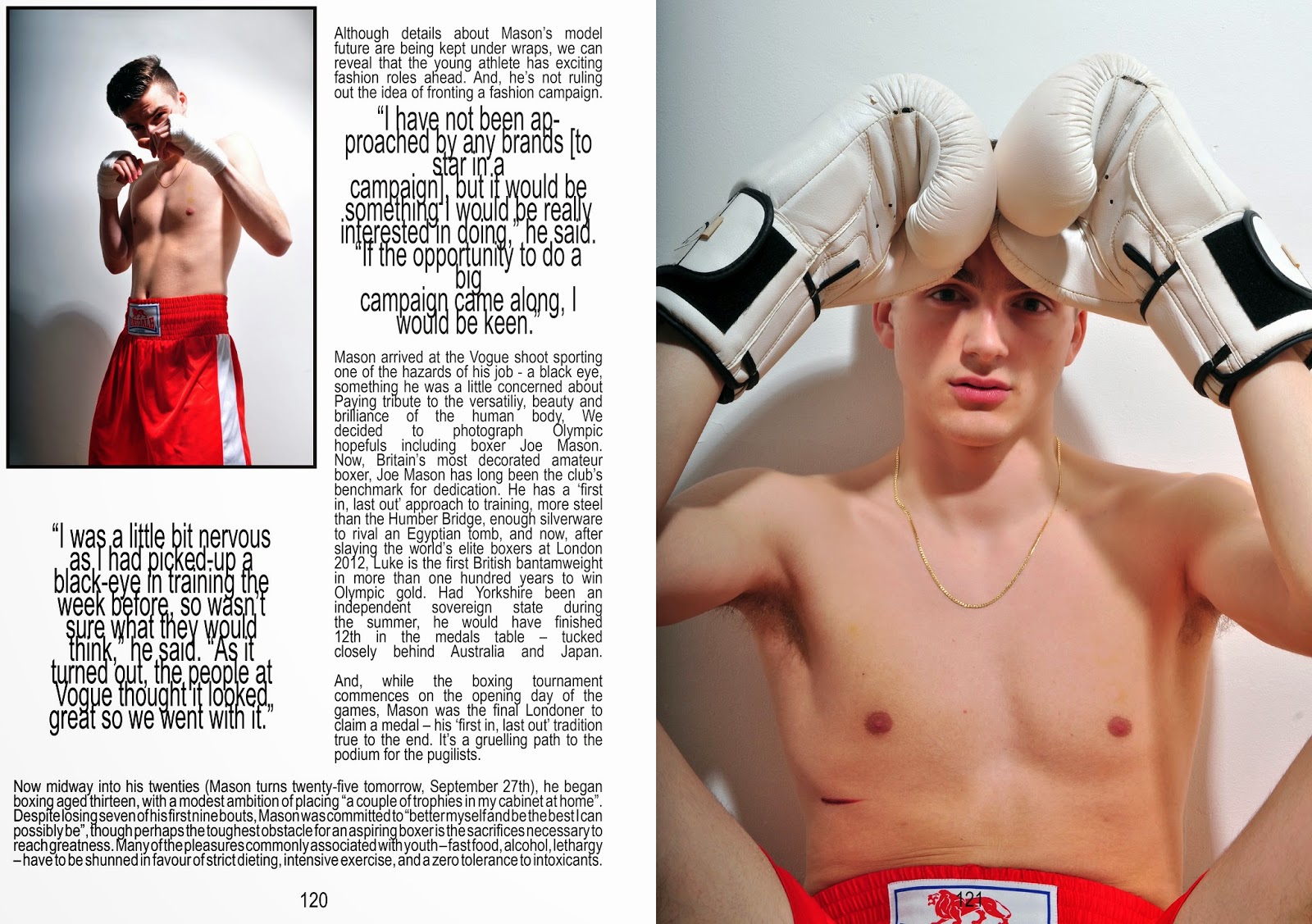
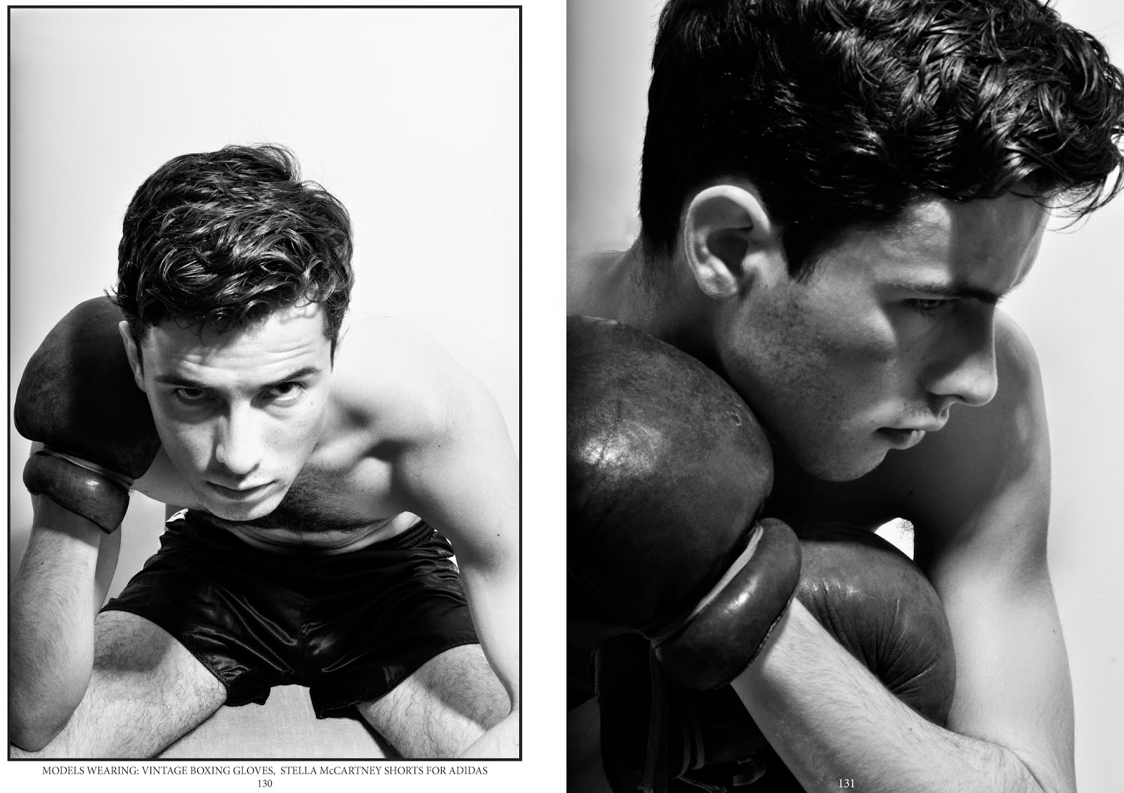
The two editorial shoots required  a lot more thought than I expected. When writing my proposal I did start off with the ambition to create some sort of boxing themed editorial, but I wasn't sure how I could make it fashion based. Coming across Luke Campbell's VOGUE story inspired me to create something similar. As my initial idea was to demonstrate and challenge peoples pre conceptions of fighters,I thought it would be perfect to play on the idea of a "pretty" boxer. Casting the model for this shoot was difficult, I wanted someone who didn't have the obvious boxers broken nose but someone who still had an element of aggression and intensity In their eyes. The model I ended up using did work really well for the plan I started with, he has a few scars on his face which brings the element of fighting into it, but he also has very good cheek and brow bone structures, which ties in the model element I was looking for. A problem I faced with this shoot is choosing what to do with it and how to display it, I already had a masthead in mind [Complex magazine] that I wanted to base it on but I wasn't entirely sure about layout and purpose. With a little more research into Luke Campbell's debut as a model for select, I came across many interviews accompanied by photo shoots (not all fashion based). It became obvious that this shoot would be perfect as an interview/feature editorial, so I started to plan out a layout that could accompany text, it was all going smoothly and to plan, but then I realised I would have to find text to go with it. The more appropriate option would have been to create my own interview with a boxer [but my model was just an ordinary boy, not a boxer]. In the end I just decided to piece together snippets from Luke Campbell's existing interviews and change the name. Although this sounds like a cheaters way out, I am more focused on the creative and visual side of editorial spreads and not journalism. As for the second photoshoot, I already had a model in mind. I wanted someone that looked the complete opposite to a boxer, pretty, well groomed and slim. With his experience of modelling the shots were perfect, they related to boxing through the styling, but the style of the magazine was perfectly demonstrated through his professional understanding of modelling. This shoot is probably the best and easiest I have done so far. The poses are fierce but at the same time beautiful, and this is exactly what I was hopping for.


23rdApril2014


(Authors own, Editorial based on Complex Magazine)


30thApril2014


(Authors own, Editorial based on Sharp Magazine)


Saturday, May 3, 2014

Photo Shoots & Editing

25thMarch2014
These are the final images produced from the overlapping inspired photo shoot. I feel that I have achieved exactly what I intended to, the imagery really speaks for itself, the concept of boxing, movement and elegance is all portrayed through one composition. In order to produce these final images I had to take about 100 photographs of a single movement e.g. skipping or punching… As simple as this may sound - clicking away while my model skips/punches - it certainly was not. I used a pop up studio for this shoot, which consisted of a flash and a soft box, so repeatedly clicking away at the shutter button will only deactivate the flash producing pitch black photos. Potentially I wanted capture the rope at different positions as it moved, but it seemed to be getting it at the same position every time.  Embarrassingly, to resolve this problem I had to ask my model to slowly do one skip at a time and I would then calculate by eye when I would have to release the shutter button. This was an extremely slow process but the results produced were definitely worth it. Once I had collected all the photos I needed, I transferred my images into one document on Adobe Photoshop and simply altered the opacity of each layer until I was satisfied.

(Authors Own, Experimenting with photoshop skills - Skipping&Boxing)

27thMarch2014
(Authors Own, Experimenting with photoshop skills - Masculine vs. Feminine)

Unlike the previous shoot this one proved to be much simpler due to the movements required. As I previously mentioned, dance is becoming a new inspiration for my project. Before the shoot I researched ballet poses by watching clips on youtube and googling images. I converted these ideas into a visual mood board to show my model and then I let him move freely while I photographed him. The casting for this particular model was easy, this is a friend of mine who previously attended gymnastic classes, his physique is slim but muscly, not too big and not too small. The poses that he was performing accentuated his muscles greatly which worked really well when creating the double exposure. The only difference concerning editing this shoot was that I felt the images needed more contrast, so that the shadows created by his muscles were accentuated. The positioning of the overlapping muscles reminded me of wings which motivated the next idea [see below]. I decided to really play on the idea of masculinity and femininity. So I then styled my model in all white boxing gear; white hand wraps, white boxing gloves and white shorts with a pair of handmade angel wings. The angel wings really exaggerate the feminine aspect of my idea, so to counter balance this I decided to super impose tattoos all over my models back and arms. I shot with and without wings. I am really happy with the results produced from this shoot, it spurted from a random creative visual and its transpired into another interesting visual. If I were to reproduce these images at any stage and build upon them, I think I'd give a lot more thought into tattoo design and placement, but for this idea I think its worked well.

2ndApril2014
(Authors Own, Experimenting with photoshop skills - Boxing vs. Ballet)

Sunday, April 6, 2014

Test Film

17thMarch2014
Following on from the previous post, this is the short film I produced in conjunction with the documentary style photography. Unfortunately the short film wasn't finished in time for the group crit, so I didn't have time to listen to my peers views and opinions on what I had achieved, nor did I have time to add in the ideas I was given. I am not entirely satisfied with the final outcome of this film, for example some of the clips run for too long and can be repetitive or boring, but the main focus when producing this film was to obtain skills to use equipment needed to produce a film e.g. Camera skills and practicing with editing software. The film hasn't been completely  useless due to the footage I have collected and the fact I have gained useful and transferable skills. As well as this I feel like the downfalls will help me choose what will work well together and what wont, and how long to preview certain clips for to keep my audience engaged. The film is not conceptual enough for a final piece but I think it would work really well for an Adidas [logo mostly present throughout] or a promotional boxing advertisement. Something perfect I can make use of from this film is the soundtrack I have chosen. It has a close connection to the boxing world as it has been used for many fighters 'big entrances' and used in many short boxing films. I think this part of my project has taught me the biggest lesson so far, and I am really happy that I have seen this process to the end this early on in
(Authors Own, Experimentation film - Learning how to use software and equipment)                             my project, because now I feel fully prepared and extremely excited to tackle the final film piece.


(Authors Own, Documenting Street-wise gym in Loughton)

Secondary Research - Film&Photography

7thMarch2014
After the first peer crit I managed to take a lot of useful notes and turn them into potential ideas. It was made clear to me that my starting point had not excelled quick enough and I was realistically still at my research stage. I was advised to start looking at artists and photographers that interested me, and to start watching films that were boxing related to hopefully gain ideas for interesting imagery. There were suggestions of 'The fighter' starring Christian Bale, 'When we were Kings' directed by Leon Gast. These were all fantastic suggestions, and i went home to watch some of them straight away. It took about a week in total to watch all these suggested films, some interested me more than others based on story line and plot. But the two films that had the most interest to me where the older films such as 'Rocky1', 'When we were Kings' and 'Raging Bull'. Raging Bull took a particular interest to me, due to the alternative approach to the way it was filmed. I took loads of notes during this film based mainly on camera angles, composition, portrayal of characters, contrast and fashion. These are important aspects to me because I aim to produce my own film as a final outcome, so gaining stimulating and thought-provoking ideas is really key to help me produce a successful piece.

 (Youtube, Clip from Ranging Bull)

I have recently watched the film Raging Bull which is about an emotionally self -destructive boxer's journey though life  as the violence and temper leads him to the top of the ring,  it meanwhile destroys his life outside it. Director, Scorsese made it clear during filming that he did not appreciate the traditional way in which fight films show fights from a spectators' view. He insisted that one camera operated by the Director of Photography, Michael Chapman, would be placed inside the ring and he would play the role of an opponent keeping out of the way of other fighters so that viewers could see the emotions of the fighters, including those of Jake LaMotta. I like the reasoning behind the way in which the scenes are directed but what I was mostly interested in was the extremely high contrast black and white filter the film is shot in. The really dark black shades really emphasise the harsh and gritty reality of boxing by highlighting muscle structure or wounds and darkening the brow area creating a really intense gaze. I took loads of notes about camera angle, personas, stereotypes, fashion etc… But it really overwhelmed me with ideas which brought my creative thought process to a stand still, I had no idea where I wanted to take my project. It took me a while to work out what it was I really liked about the film, although the camera angles were interesting and unique, I think using them in my own work would come across quite cheesy and obvious. What Ive noticed while looking into boxing is that most imagery based around it is in black and white with a really strong contrast. I decided that this idea would be ideal to experiment with, which brought me onto researching artists that worked in high contrast, and are focused on capturing lifestyle and personality. 

10thMarch2014
(Adekokan, Adde. Collection of Triptychs)
I came across the  Germany-based street photographer Adde Adesokan, his photos series ’Triptychs of Strangers’ depicts photographs of strangers that capture wonderful images including the portrayal of the stranger’s personality… The black and white images depict the subjects features using a cropped frame and fairly high contrast filter. The background is very out of focus which draws your attention entirely to the model. I think the images are beautifully thought out and put together, revealing subtle amounts of a personality. The main aspect of these images that I like is the composition of the portraits, I think that the unusual framing of them intensifies the eyes and if blown up to a big scale the images would be really captivating. Because my project is about boxing I feel like the use of a triptych in this way would not be necessary to experiment with.

(Enriquez, Sebastian. Collage of photographers imagery from series Postcard from Perut)

SebastiƄn Enriquez is a freelance documentary photographer and storyteller based in Lima, Peru. One of his most famous series of images link perfectly to my project - Postcard from Peru; Boxing for a dream. The series consists of images taken in Rojitas boxing gym in Peru. When Enriquez began this project on boxers he was curious about what motivated so many young people to get into a ring and get punched. "Why not play soccer or dance?" In the ghettos of Callao - the main port and one of the most dangerous places in Peru - has a special niche for boxing. This sport has always been a window of opportunity for young people, especially in a place where many of them must learn how to leave their problems in a ring and find a future by the gloves. Most of the children are disadvantaged and fighting to get out of poverty, drugs and crime. The ring becomes a subliminal space where the violence they face every day is tamed. Enriques series of photographs shows the workouts and training sessions in "Rojita" boxing school, the most important generator of boxing talent in Peru, which brings together teenage parents, young workers, colleagues and above all children.