Showing posts with label #photoshoot. Show all posts

Sunday, May 11, 2014

Final Editorial Outcomes

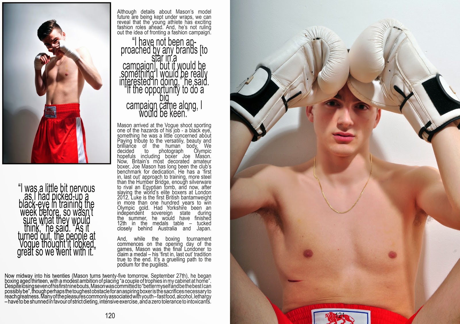
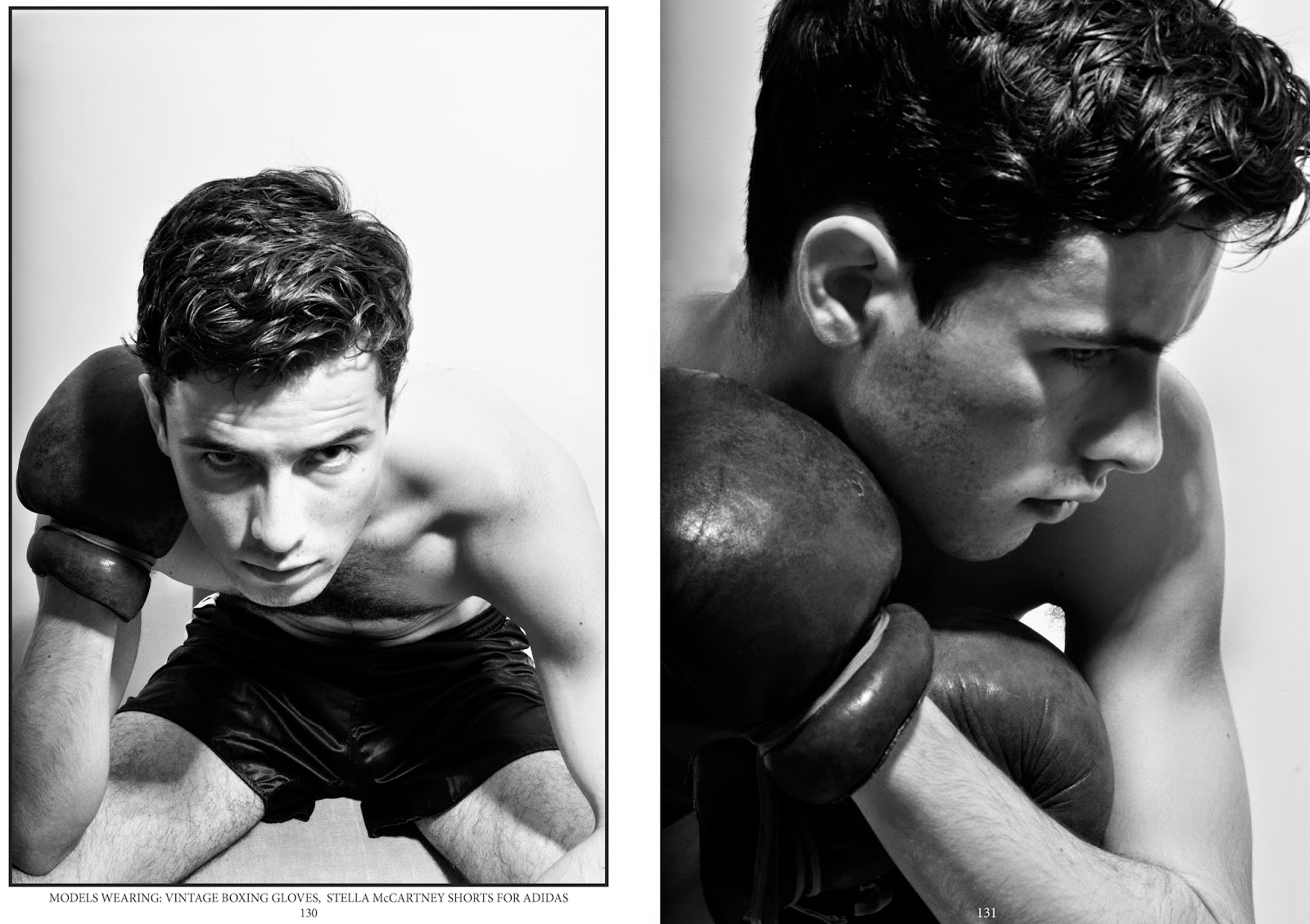
The two editorial shoots required  a lot more thought than I expected. When writing my proposal I did start off with the ambition to create some sort of boxing themed editorial, but I wasn't sure how I could make it fashion based. Coming across Luke Campbell's VOGUE story inspired me to create something similar. As my initial idea was to demonstrate and challenge peoples pre conceptions of fighters,I thought it would be perfect to play on the idea of a "pretty" boxer. Casting the model for this shoot was difficult, I wanted someone who didn't have the obvious boxers broken nose but someone who still had an element of aggression and intensity In their eyes. The model I ended up using did work really well for the plan I started with, he has a few scars on his face which brings the element of fighting into it, but he also has very good cheek and brow bone structures, which ties in the model element I was looking for. A problem I faced with this shoot is choosing what to do with it and how to display it, I already had a masthead in mind [Complex magazine] that I wanted to base it on but I wasn't entirely sure about layout and purpose. With a little more research into Luke Campbell's debut as a model for select, I came across many interviews accompanied by photo shoots (not all fashion based). It became obvious that this shoot would be perfect as an interview/feature editorial, so I started to plan out a layout that could accompany text, it was all going smoothly and to plan, but then I realised I would have to find text to go with it. The more appropriate option would have been to create my own interview with a boxer [but my model was just an ordinary boy, not a boxer]. In the end I just decided to piece together snippets from Luke Campbell's existing interviews and change the name. Although this sounds like a cheaters way out, I am more focused on the creative and visual side of editorial spreads and not journalism. As for the second photoshoot, I already had a model in mind. I wanted someone that looked the complete opposite to a boxer, pretty, well groomed and slim. With his experience of modelling the shots were perfect, they related to boxing through the styling, but the style of the magazine was perfectly demonstrated through his professional understanding of modelling. This shoot is probably the best and easiest I have done so far. The poses are fierce but at the same time beautiful, and this is exactly what I was hopping for.


23rdApril2014


(Authors own, Editorial based on Complex Magazine)


30thApril2014


(Authors own, Editorial based on Sharp Magazine)


Saturday, May 3, 2014

Photo Shoots & Editing

25thMarch2014
These are the final images produced from the overlapping inspired photo shoot. I feel that I have achieved exactly what I intended to, the imagery really speaks for itself, the concept of boxing, movement and elegance is all portrayed through one composition. In order to produce these final images I had to take about 100 photographs of a single movement e.g. skipping or punching… As simple as this may sound - clicking away while my model skips/punches - it certainly was not. I used a pop up studio for this shoot, which consisted of a flash and a soft box, so repeatedly clicking away at the shutter button will only deactivate the flash producing pitch black photos. Potentially I wanted capture the rope at different positions as it moved, but it seemed to be getting it at the same position every time.  Embarrassingly, to resolve this problem I had to ask my model to slowly do one skip at a time and I would then calculate by eye when I would have to release the shutter button. This was an extremely slow process but the results produced were definitely worth it. Once I had collected all the photos I needed, I transferred my images into one document on Adobe Photoshop and simply altered the opacity of each layer until I was satisfied.

(Authors Own, Experimenting with photoshop skills - Skipping&Boxing)

27thMarch2014
(Authors Own, Experimenting with photoshop skills - Masculine vs. Feminine)

Unlike the previous shoot this one proved to be much simpler due to the movements required. As I previously mentioned, dance is becoming a new inspiration for my project. Before the shoot I researched ballet poses by watching clips on youtube and googling images. I converted these ideas into a visual mood board to show my model and then I let him move freely while I photographed him. The casting for this particular model was easy, this is a friend of mine who previously attended gymnastic classes, his physique is slim but muscly, not too big and not too small. The poses that he was performing accentuated his muscles greatly which worked really well when creating the double exposure. The only difference concerning editing this shoot was that I felt the images needed more contrast, so that the shadows created by his muscles were accentuated. The positioning of the overlapping muscles reminded me of wings which motivated the next idea [see below]. I decided to really play on the idea of masculinity and femininity. So I then styled my model in all white boxing gear; white hand wraps, white boxing gloves and white shorts with a pair of handmade angel wings. The angel wings really exaggerate the feminine aspect of my idea, so to counter balance this I decided to super impose tattoos all over my models back and arms. I shot with and without wings. I am really happy with the results produced from this shoot, it spurted from a random creative visual and its transpired into another interesting visual. If I were to reproduce these images at any stage and build upon them, I think I'd give a lot more thought into tattoo design and placement, but for this idea I think its worked well.

2ndApril2014
(Authors Own, Experimenting with photoshop skills - Boxing vs. Ballet)

Sunday, April 6, 2014

Test Film

17thMarch2014
Following on from the previous post, this is the short film I produced in conjunction with the documentary style photography. Unfortunately the short film wasn't finished in time for the group crit, so I didn't have time to listen to my peers views and opinions on what I had achieved, nor did I have time to add in the ideas I was given. I am not entirely satisfied with the final outcome of this film, for example some of the clips run for too long and can be repetitive or boring, but the main focus when producing this film was to obtain skills to use equipment needed to produce a film e.g. Camera skills and practicing with editing software. The film hasn't been completely  useless due to the footage I have collected and the fact I have gained useful and transferable skills. As well as this I feel like the downfalls will help me choose what will work well together and what wont, and how long to preview certain clips for to keep my audience engaged. The film is not conceptual enough for a final piece but I think it would work really well for an Adidas [logo mostly present throughout] or a promotional boxing advertisement. Something perfect I can make use of from this film is the soundtrack I have chosen. It has a close connection to the boxing world as it has been used for many fighters 'big entrances' and used in many short boxing films. I think this part of my project has taught me the biggest lesson so far, and I am really happy that I have seen this process to the end this early on in
(Authors Own, Experimentation film - Learning how to use software and equipment)                             my project, because now I feel fully prepared and extremely excited to tackle the final film piece.


(Authors Own, Documenting Street-wise gym in Loughton)

First Photo Shoot at Street Wise Gym, Loughton

15thMarch2014
(Authors Own, Portraits of Boxers)

(Authors Own, Documenting Street-wise gym in Loughton)


This particular page demonstrates the images I produced on my visit to Street-Wise gym in Loughton. On arrival I aimed to only capture footage for a short film, but when I had finished up with the filming a member of the gym asked me to take a picture of him posing with a fellow fighter "Phillip Bowes" [who I filmed]. I was initially determined to produce my documentary style images in an old fahsioned, vintage gym e.g. Repton Boxing Gym in Bethnal Green, so that my compositions echoed character and history that is often associated with boxing. When I was actually there, in the thick of all the testosterone, sweat and grunts, the atmosphere alone created a perfect environment for me to shoot. This sparked a spontaneous idea so I had to think fast about the sort of outcomes I had planed, combined with having to adapt my initial ideas to suit the new location. Unprepared and not very confident I continued to take these "typical" after fight shots of some of the guys. Following on from this I asked a few more members if it would be ok for me to take some simple portraits of them. Some were confident and happy to help, while others were not so sure, but with a bit of persuasion I managed to capture some really beautiful high contrast, black and white images. The compositions are simple head shots with complementing backgrounds, which have been edited in Adobe Photoshop so that the focus is on the individual with a subtle hint of boxing in the background to confirm the meaning of the shoot. The other images have the same impression as the portraits, but unlike the portraits, these images are less contrived with no posing at all. I just observed some of the things going on in the gym, such as training, sparing, resting, equipment etc and documented it as everything was happening around me. I am really happy with both sets of imagery I have produced. Although it wasn't what I had originally set out to do, I feel that I have exceeded my first idea by creating an atmosphere of adventure, experience and history purely through the use of photography, and carefully selected compositions.  

Following on from this photo shoot was another peer crit session. This time there were different people in my group which meant I acquired different and unique responses and ideas, this is always useful to me because I think I learn best when I analyse other peoples work and vise-verse. I raised the point based upon my own work that I wasn't entirely happy about the way in which my project was moving in. I thought it was too sport based and there weren't enough conceptual, interesting, thought provoking ideas incorporated within in the work. I proposed the visualization of contrasting the conflicting practice of Dance with Boxing. Not everyone was keen on the idea, but I was given loads of great ideas that I could use in my work. For example someone suggested comparing and contrasting the different between street fighting / judo with boxing, another suggestion was child boxing / women's boxing with male boxing. I personally thought that contrasting another fight based sport or opposite sex boxing was still too sport based and this isn't what I was really aiming for. I still considered some of the ideas I was given, but im also interesting to explore the idea of dance.
(Authors Own, Documenting Street-wise gym in Loughton)


(Authors Own, Documenting Street-wise gym in Loughton)

Sunday, February 23, 2014

Final Outcome


(Authors Own, Layout)
(Manners, Charlotte Photography & Styling)


The imagery to the right shows the groups final outcome, the text was written by Nikisha and "full bleed" photography was taken  by Charlotte Manners. Somewhere along the lines of creating the spread, other members of the group had not considered the pre-designed layout that I had produced. Although I feel that the imagery shot by the photographer is excellent, it does not meet the requirements of the layout design, or reflect the trend we initially decided upon. Sadly the photography was handed to me a day before the due date, making it too late to create an entirely new page layout in time…. I thought that it was essential to demonstrate the lifestyle and fashion of the people that we are promoting our new trend to, so I decided to finalise the outcome by producing a more relevant editorial style photo shoot. As I worked so hard on designing the layout and creating a "Paper Wardrobe" for the spread, I felt an obligation to complete the project to the best of my ability. 

Below shows my personal final outcome, still using the original article produced by Nikisha, but my own take on the editorial photography. I think that this imagery reflects the trend more appropriately, showing the swerve and sophisticated lifestyle through choice of location and fashion that is "on trend" through choice of styling and clothing. I am now happy with the final outcome, and I think that it accurately demonstrates the initial concept, but something I feel that would make the editorial stronger is if we had contrasting gender models to promote the clothing. 

(Authors Own, Layout, Photography, Styling and Clothing Design)
Here is a finalised version of the "Paper Wardrobe"  that i completed, it shows two models of the opposite sex in simple black underwear, with "on trend" clothing to use interactively. The layout of this particular concept will appear as a double sided card insert where the audience are required to choose which side of the paper wardrobe they wish to cut out and use. I now realise that this idea slightly resolves my worry about only having a female model in the editorial. I printed this out in both card and translucent acetate to see which would work best, and what I found is, the two materials work well together rather than each on their own.

(Authors Own, Layout and Clothing Design)
(Manners, Charlotte, Photography)

(Authors Own, Moving Giff demonstrating Female Paper Wardrobe)

Sunday, November 24, 2013

Photoshoot

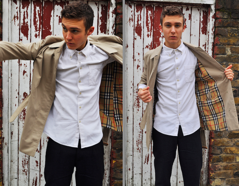
 "Author's own, Burberry themed photo shoot"
Here is the photo shoot that i produced in conjunction with my other Burberry related work. The images show the model [Joe] posing in Burberry style clothing, i styled the images making sure they still had Burberry's prorsum values e.g. slick, stylish and traditionally British… I chose this model because i think his look is iconicity British, and with the decayed, abandoned location  it contrasted flawlessly with the pristine look. I chose a verity of outfits for the model to try on based on what our design team had produced as well as keeping it typically Burberry. The design team were designing for the A/W14 collection so shirts, polo necks and scarves were incorporated in to the designs as well as the iconic Burberry trench, i experimented with the way the outfits were styled, combining blazers and polo necks to shirts and scarves.  I am extremely happy with the shots that are composed against the door with the dark red and white paint peeling off, i think the lighting if perfect, reflecting the red onto the subject making him appear glowing and fresh faced, exactly what i was looking for , for this shoot. I am also fond of the  slight appearance of the burberry check , which also works perfectly with the red door and the tiny fragment of red in the pattern. 

The four images above are ones that i was most happy with, I like the way that the model is moving but also the way I have managed to capture the movement without blurring the garments. It adds character to the images and catches an essence of reality which i think is good when promoting clothing because it allows real people to see the clothing in action and to visualise it from a realistic perspective.