Showing posts with label #Trend. Show all posts

Saturday, April 5, 2014

Primary Research & Trend Reports

20thFebruary2014


l have kick started my project by looking through collected newspaper clippings and saved tickets/programmes and putting them together in an aesthetically pleasing way. I started off this way because I was unclear where I wanted to actually start, creating something visual pleasing can often influence ideas. When looking at the collages I made from the clippings its obvious at first glance that the fashion and digital graphics used are very different from what we have today. Advertisements of fights are very basic, using only black and red ink and showing stereotypical aggressive portrayals of both fighters. Advertisements today are a lot bolder, with the amazing technology that is available to us we are able to create emotive pieces of art work. An example shown on the right experiments with interesting typography to create a fitting atmosphere, whereas the examples on the left show simplistic boxy typography. Another difference lies in the imagery used, in the poster for Mayweather and Pacquiao there is an electric storm or or star exploding behind both of they're perfectly molded bodies. Again the 80's references just keep it simple due to the lack of technology. I think its good to look at the different generation of design aspects because the recourse could definitely inspire future work of mine throughout this subject area.


Creating collages out of the old newspaper clippings did seem pointless at first, and I felt I was wasting my time trying to fill my sketch book with work. Although at first it seemed pointless it has fueled ideas of my own based on styling, typography, layout, photography style and headings or slogans that could help create names for pieces I will create. Whilst putting the copies of the clippings into one aesthetically pleasing document on photoshop I accidentally set the transparency of one of the images to 50% and I really liked the results that this produced. The text and imagery combined worked really we together. Although its nothing worth presenting, this accidental outcome has helped me to think outside the box, and plan for future work.


(Authors Own, Collected Imagery Scanned in)
I then created a general mood board surrounding the area of boxing, including fashion imagery, documentary style photography, tickets, newspaper clippings etc… I thought that by starting with a very broad understanding of the sport I could then begin to branch off into more specific, personal aspects and transform it into something creative. After gathering imagery I started to look at the more personal elements of my project - Family. My family have a strong link with the sport, and much memorabilia has been collected over the years. My Aunties ex-husband was the European Heavyweight Champion of the 1980's - John L Gardner - which has left me with loads of amazing primary sources that will help me to produce some really strong work in the coming weeks.2ndMarch2014
(Authors Own, Collage of Imagery found on google and personal collection)
5thMarch2014

When creating the mood board, something that really fascinated me was the obvious change in fashion. Most of my images are from the 1980's or the current 2014 period, and the drastic transformation from simplistic to glitzy and contrived sportswear is very obvious. It seems that in the 1980's things were fairly plain with iconically "masculine" / "manly" colours [Red, Blue, Black] whereas now, things seem to have derived from this idea of masculinity and moved onto the idea of fame and glamour. Below shows a series of trend reports that I created that compare the fashion of boxing in the 80's to the fashions of today. To me the results are very different and the contrast is apparent in many mediums, from materials used, fit of sportswear, colour etc… 

(Authors Own, Trend Report)
To begin with I compared the trends and fashion of the two well known boxers George Groves [2014] and Muhammad Ali [1980]. This comparison is not obvious at first, the colours remain fairly simple in both, sticking to classic blue and red, but there are really important differences in the fabrication of the sportswear. When looking at the length of the shorts it is apparent that in the 80's the design was a lot shorter than todays current design, this is just due to what was considered fashionable at the time. The high wasted design of the shorts acts as a guideline so that the opponent cannot "hit bellow the belt" - a rule in boxing is that boxers shorts must be raised so the opponent is not allowed to hit to the groin area with intent to cause pain or injury. A major change in "uniform" is the mouthguard, not only has it become easily customised, but the fabric has been improved for durability, comfort and protection. Initially they were manufactured from impressions using wax, rubber and steel springs were even recommended to reinforce soft materials. Subsequently they were drastically improved by a dentist who used a transparent acrylic resin to form what he termed an "acrylic splint". It was moulded to fit unobtrusively over the upper or lower teeth, it also meant that the athlete could talk in a normal manner while the mouth guard was in place. Now days the technology of material knowledge and manipulation has improved greatly and a simple thermo-plastic material manufactured in a pre-formed shape in various sizes can be adapted to fit more closely to an individual's teeth and gums by heating and moulding such as boiling then placing in the mouth.
(Authors Own, Trend Report)
Here I have compared the trends of the two boxers John L. Gardner [1980] and Phillip Bowes [2014]. With this contrasting trend report it is a lot more evident that fashion has changed, not only has the fabrication and fit of the sportswear improved drastically, but the colours and style have become more radical and eccentric. Despite being east London born and bred Bowes took the unusual decision to represent Jamaica at the Commonwealth Games. The fighter felt the only way he could pursue his dream of reaching the top of his game would be to swap the English flag for the yellow green and black of his parents’ homeland, and this is strongly reflected through the colours of his kit. I created these trend reports not only to get an understanding of how boxing had changed, but its also helped me to think of styling ideas for future photoshoots, and how I can portray different times or eras.

Sunday, February 23, 2014

Final Outcome


(Authors Own, Layout)
(Manners, Charlotte Photography & Styling)


The imagery to the right shows the groups final outcome, the text was written by Nikisha and "full bleed" photography was taken  by Charlotte Manners. Somewhere along the lines of creating the spread, other members of the group had not considered the pre-designed layout that I had produced. Although I feel that the imagery shot by the photographer is excellent, it does not meet the requirements of the layout design, or reflect the trend we initially decided upon. Sadly the photography was handed to me a day before the due date, making it too late to create an entirely new page layout in time…. I thought that it was essential to demonstrate the lifestyle and fashion of the people that we are promoting our new trend to, so I decided to finalise the outcome by producing a more relevant editorial style photo shoot. As I worked so hard on designing the layout and creating a "Paper Wardrobe" for the spread, I felt an obligation to complete the project to the best of my ability. 

Below shows my personal final outcome, still using the original article produced by Nikisha, but my own take on the editorial photography. I think that this imagery reflects the trend more appropriately, showing the swerve and sophisticated lifestyle through choice of location and fashion that is "on trend" through choice of styling and clothing. I am now happy with the final outcome, and I think that it accurately demonstrates the initial concept, but something I feel that would make the editorial stronger is if we had contrasting gender models to promote the clothing. 

(Authors Own, Layout, Photography, Styling and Clothing Design)
Here is a finalised version of the "Paper Wardrobe"  that i completed, it shows two models of the opposite sex in simple black underwear, with "on trend" clothing to use interactively. The layout of this particular concept will appear as a double sided card insert where the audience are required to choose which side of the paper wardrobe they wish to cut out and use. I now realise that this idea slightly resolves my worry about only having a female model in the editorial. I printed this out in both card and translucent acetate to see which would work best, and what I found is, the two materials work well together rather than each on their own.

(Authors Own, Layout and Clothing Design)
(Manners, Charlotte, Photography)

(Authors Own, Moving Giff demonstrating Female Paper Wardrobe)

Trend Report Canary Warf Vs. Shoreditch

Sunday, February 16, 2014

Creating a Trend


The aim of this project is to create a trend, give the trend a name, style, indication of where these people live, age range, hangouts and music they are into etc… The  project is to be lifestyle driven, looking back at the 60's as an example. A number of   creative famous photographers, models, musicians, designers [David Bailey, Biba, Mary Qaunt, Twiggy, Jean Shrimpton, The Beatles, Rolling Stones] all contributed to shaping the term the swinging 60’s. Back then areas like Cannarby St and Kings Road were the fashionable areas. But today the current trend is Hipsters, seen in areas such as Dalston and Peckham. These areas have not always been considered desirable but what we have found out is that creative individuals and the media strongly effect the popularisation of an area… For example, Dalston used to be extremely run down and cheap, meaning that students could afford to buy houses there, as well as artists investing in cheap studio spaces. But these two groups of people need somewhere to hangout and be sociable, so local shop/bar owners invest in these new residence and create a "night/social life"


In groups we started to brainstorm what makes London unique, we came up with a range of things from the multicultural population it holds, history, fashion, icons/idols, film, music etc… Once we had thoroughly dissected "what makes London unique", we started to narrow subsections down into points that interested us the most to come up with our own trend…  


We started looking into the contrast of class and wealth and looking at how certain clothing gives people power and respect. We referred back to the brief and looked at a famous trend in the 60's of the Mods, they were very much focused on music and fashion, often tailor-made suits and music including soul, ska and R&B, and well recognised by they're  motor scooters usually Lambretta or Vespa. It wasn't so much the fashion we were interested in, but the respect and power this trend brought to people who abided by it,  it was argued that mods and rockers were youths with no serious views, who lacked respect for law and order. This led us to look at other gang related cultures, Bugsey Malone, The Mafia etc… But it brought us onto something really interesting, a gang of people named Sapeurs. They emerged out of a movement called la SAPE, that was originally inspired by a 1960s Pop Star by the name of Papa Wemba who wanted to stray from the traditional Congolese attire. Its mostly young men who drape themselves in elegant sharp attire, creating flamboyant identities for themselves through their brightly coloured suits, and luxurious swagger. Despite the extreme poverty in which they lived - their houses often simply metal shacks - the Sapeurs were driven to look their best at all times. This style is very extreme and would be hard to bring into London due to the current dark coloured trends, so we came up with an idea [also inspired by the film Bugsey Malone] of the secret identity and speakeasies.


“Those of them who can work double jobs; those who can’t must beg, borrow and occasionally steal; whatever it takes to strut in Versace, Prada and Gucci.” 

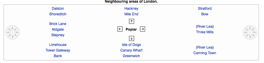
After coming up with multiple ideas based on this new trend, we had to have a suitable area to accommodate it, we decided it had to be somewhere rundown, but somewhere with potential. After much thinking and consideration we came up with the East end area of Poplar. Poplar is an historic, mainly residential area of East London in the Borough of Tower Hamlets with an extremely wealthy neighbouring area,Canary Warf. Not only Canary Warf, but the surrounding neighbourhoods are already growing communities, and these areas all have fantastic public transport links to help encourage people to visit Poplar. 


(Authors Own, Images of Poplar, Canary Warf & unique shops Collected From Google)
With a little more research in to growing areas such as Shoreditch, it became clear how we could begin to make Poplar an area people want to visit. The accommodation is already relatively cheap and there is a community driven high street which is central to 4 major tube stations "Poplar", "Allsaints", "India West Quay" and "Blackwall"… The high street would slowly be renovated with small unique business moving in that encourage our trend e.g. a combination of Retro boutiques and clothing shops where you can buy bold eccentric trends as well as simple tailored business suits with subtle pops of colour… We also came up with the idea of encouraging combined businesses like record shops combined with coffee shops, or hairdressers combined with vintage clothing shops. We hoped that the combination of businesses may help people to meet one another and share interests or create new ones, it would also encourage people that have already adopted our trend/lifestyle pass it on to others. Due to the prominent wealth associated with working in Canary Warf we thought that our audience would like to unwind in a swanky, sophisticated and comfortable environment, such as a club decorated with natural, warm interiors [Like a gentleman's club].

(Authors Own, Research Images taken in Topshop)

Because our trend does not exist at the moment it was hard to find clothes that could relate to our ideas, but the trustworthy TopShop didn't fail to let us down. With the Canary Warf worker still in mind we looked for smart, fitted and formal clothing with a massive twist of extreme colour clashing. It was relatively hard to match such vibrant and contrasting colours together in a sophisticated way, but I think we achieved some good imagery from this visit and managed to make it look anything but "chavy" and "nu-rave". Given that working in Business is stressful and can be really monotonous, our trend is great for the average business man or woman to relax and feel comfortable or someone different for a few hours in these exciting clothes and swanky lifestyle with a cocktail. I think the results we achieved with this quick styling task were really helpful and its definitely given our group something to work with when we get to our final editorial.

(Thomson, D C. Bunty the book for girls, 1977)


I was in charge of the layout design in the group and came up with an interesting concept that inspired me whilst reading "stylist" magazine the previous week. As our trend is extremely bold I thought it would be practical and stylish to keep the layout design simple and uncluttered. I had some initial design ideas for the overall layout but the concept for displaying the clothes was really quirky and different to anything I've done before. I suggested that like in the famous Bunty comics, we make a "Paper wardrobe" [see left] This idea would allow us to demonstrate our completely original trend without having to purchase any clothing for a shoot. I proposed that we do an underwear shoot with male and female models to accompany this paper wardrobe, that could be displayed as a tear out insert. I felt that this fun and unusual idea may not be enough to sell our trend so it was agreed we would try and pull together our own personal on trend items of clothing from home and produce a stylish editorial shoot that shows a clear understanding of contrast. It was suggested as a group this would be a good idea, so I then moved on to researching fashion magazine articles. I found many interesting articles all of which were filled with strong imagery and text. I  wanted it to be quite quirky and original so I looked into magazines with unusual layouts. As you can see below I came across an interesting fashion magazine called "cent", its layout is horizontal unlike most magazines, and the dimensions are perfect to create the paper wardrobe.

(Authors own, images collected from google images of magazine spreads)

I started to design the clothes for the underwear models in InDesign, using garments on the Topshop website to inspire shape of the garment as well as all the other research e.g trend reports, Topshop research, Trend research etc… Once I had finished designing the clothes I combined them on one page with the models, strategically placing each garment. I then started to create a template for our editorial layout, I made space for two full bleed landscape images and several separate areas for research pictures such as trend reports, area documentation and events related to our trend.  I am really happy with the layout and the insert designs, but unfortunately the photographers in the group didn't shoot in a landscape format so I had to work with what  I was given. I was not at all happy with the end result because it looked rushed and it didn't reflect our trend at all, but i will personally overcome this problem by shooting my own images in my own time . 

(Authors own, InDesign Design Idea)