Showing posts with label photoshop. Show all posts

Wednesday, March 11, 2015

Last minute shoot


(Authors Own, Contact Sheet)
 Here you can see the product of a very last minute shoot. I used my mum, who was willing to show off more than just her face and superimposed my original models head onto her body.I continued to portray the older woman's insecure nature by photographing just the back. When all the images were put together in the final layout I noticed that orange was the dominant colour, I intended for the shoot to be a variety of colours but as two of my images work well in black-and-white I had to find an alternative. with the lack of accessible garments I decided to revert back to the original idea of colour correction in photo shop. Taking inspiration from ID magazine I produced a realistic layout using appropriate text, design, style and dimensions. On the next page, displayed, are my final selection of images incorporated into my final layout design, appropriate for ID magazine.  During one of the shoots my model unintentionally posed covering her left eye, I later realised that this was relevant for my magazine choice. To conclude my photo shoot I decided to design a mockup of the issue my editorial could be exhibited in.
(Authors Own, Editing Process)

(Authors Own, Layout Design)

Sunday, February 8, 2015

Exhibition Visit - Guy Bourdin


The image Maker, was an amazing exhibition at Somerset house featuring over 100's of works previously unseen images by the influential and enigmatic fashion photographer Guy Bourdin. Bourdin's editorial and advertising imagery, took the basic function of the fashion photograph -to sell clothing, beauty and accessories- and made it into something rich and strange. Bourdin established the idea that the product is secondary to the image, he developed a distinctive style of visual storytelling which continues to serve as a source of inspiration to contemporary fashion photographers from Tim Walker to Nick Knight. He pushed the boundaries of what we consider beautiful and desirable creating a  provocative and surreal approach to fashion imagery. Bourdin plays around with the concepts of repetition, scale and proportion. For a New york shoot he demanded giant shoes , not theatrical props but meticulous oversized replicas. 
The manipulation of repetition, scale and proportion can dramatically change the mood and meaning of a composition, it emphasises  the importance (or un-importance) of an object or area. Often the focal point is emphasised by making an object larger in proportion to the rest of the elements of the artwork, or by simply repeating it. Elements that are large in comparison with the background or that fill the picture and bleed off the edge will give the impression of drama, importance, intensity or happiness. Without the limitation of just a single point of interest, repetition helps the eye dance from point to point. I would like to incorporate similar elements into my work and experiment with repetition to elude the 'regular' fashion shoot.


Friday, January 9, 2015

Prompt 2 - Photo shoot Portraying Designers Initial Felt Emotion - 1205

As a group we had to determine an emotion or feeling that can relate to our assigned designer's work. The aim was to create 5-6 photographic images to represent the work in relation to this chosen emotion or feeling. .
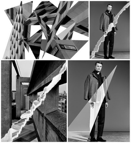
(Authors Own Moodboard - iImages Google)
To begin with, as a group, we came up with a bunch of words we instantly thought of when looking at Paula Gerbase' work. The general consensus was that the monochrome tones and simple photography used to promote her collections, gave it a melancholic feel. We also came to an agreement that the collection wasn't particularly sad or depressing but it was calm and comforting with a sombre approach. We considered most of the initial words, trying to criticise each one constructively until we found the perfect medium between comfort, relaxing, solemn, quiet etc… The outcome was the word Tranquility...


We conducted a photo shoot soon after we agreed on an emotion/feeling. We took inspiration from different imagery, looking closely at interiors, photo shoots and textiles. We each brought images we thought related and created a mood board that would help direct us in the studio. To make sure the shoot represented 1205's aesthetic we went on a shopping trip to Westfield and purchased clothes (to return) that would demonstrate this. We made sure each person in our group had a part to play in the final outcome. Whilst everyone had a go at taking some shots, we decided that it would be more efficient to give everyone individual roles too:

  • Guy too responsibility of lighting and mood 
  • Yoon helped with makeup, Hair and photography
  • Anushka took charge of photography and location
  • Seunghee and I styled the outfits and modelled 
Prior  to the photo shoot I visited luxury heritage fashion retailer Browns on South Molten street to see 1205's collection. I thought it would really help me to get a feel for the brand and experience the garments. I tried some of the items on so I could analyse quality, fit and style. The visit was really helpful and insightful, the clothes are a very modern and organic twist on tailoring and they are beautifully crafted using unusual materials. Visiting the store has inspired me to create a shoot on location with new garments. I have recently ordered some clothes on the online store Asos so that I can create this experimental shoot i have in mind
I think the majority of our images strongly related to Gerbase' work, but we had to narrow 380 images down to 5 to meet the brief criteria. Everyone chose 5 images out of the 380 taken and edited them to their own personal standard. We shared the images and deliberated as a team what worked well together as a series. To our advantage most of us had similar ideas so it wasn't difficult to decide. To the right were some of the images I edited myself, I decided that maybe the monochrome outcome would be too obvious. Instead I experimented with creating a sense of tranquility though blue tones whilst sticking to the theme and aesthetic of 1205.
It was difficult being in front of the camera rather that behind it where I am more comfortable, but to our groups advantage I knew the desired appearance of the shoot. Knowing exactly what we required made it slightly easier to define poses and necessary props / lighting. Something else I found difficult was not being able to have my creative input on the framing of some shots. Overall I think the images we have presented as our finals represent the Designer and the word perfectly.


Final Images:


(Authors Own Editing, Styling & Photography of image 1&3)

Prompt 1 - Designers Aesthetic - 1205

PROMPT 1: 
As a group, choose 5/6 words that describe your designers aesthetic.
Together as a team, create 5/6 images that visualise the words you have chosen. It is up to the group to decide how the images are made, what materials you use and how you collaborate together to make them. 

As I chose the words Geometrical and Tactile I decided to use these words to experiment with. I looked for geometric architectural structures and/or patterns and simply photographed them. Photoshop manipulation is something I feel confident using, so i decided to use this skill to manipulate some of my imagery. I also experimented with manipulating some of 1205's previous photo shoots so that the group could get an idea of how it can work for the brand.
(GROUPS FINAL IMAGES, Highlighted Red - Authors Own)
(Authors Own)


Although our final images appear to be just photographical, a number of us did experiment with different mediums. We thought that as "Tactile" was one of our descriptive words, we would try to portray this concept through manipulation. As we had already used photography as our initial response we thought it would be silly to start over. We decided to use paper  manipulation both physical and photoshop based to achieve this concept. We explored many avenues of paper manipulation: Crushing, Burning, Tearing, Crunching even simple cut and paste. We discovered that some worked better than others based on the collection. 

In addition to that, we found a medium that gives tactile property – Moulding Paste. Modeling paste is an acrylic medium that is filled with solid material. The result is a thick white substance that can create a controlled textural surface. With brush or any tools, we can make the texture that we want and leave it dry. When it dries, it becomes an opaque white when it dries. After that, we can paint, write, or do anything on top of the texture. Therefore, this is considered to be a good medium to be incorporated in following prompts.
For the word "Geometric" we came up with some ideas for pencil drawing where we looked into unique building structures in different parts of london and roughly drew them on a sketchbook(which we carried everywhere). 
We found it quite hard to represent the word "Androgynous" without using the human form (which we didn't want to use at this stage in the project). So close to giving up with the word an image was created through printing technique using a gloss varnish.


(Experimental Techniques - Photoshop, Authors Own)
(Experiments - Photoshop, Authors Own)