Showing posts with label tactile. Show all posts

Sunday, January 18, 2015

Prompt 5 - Typography - 1205


Prompt 5: 


As a Group create a series of 5/6 images that represent your assigned designers aesthetic using only type.The series of images can incorporate drawing, collage, photography, digital manipulation in any way you as a group choose, but must be created entirely from letters and words.
Individually I started to look at simplistic but creative type faces on google. As a group we decide we needed to keep it simple to represent 1205's aesthetic, so I investigated very monochrome designs. Although 1205's current typeface is as simple as Ariel font, I thought it would be interesting to play around with ideas to make it more "fun". I came across loads of 3D fonts that would work really well, creating shadows and texture, I felt that texture was an important factor in our final typography style. To move away from my preferred medium of photoshop I decided to help create physical 3D font using card. At the time brown and black paper were the only colours available to work with, which hindered the final aesthetic. We did persuade the idea using photoshop but agreed it didn't look right. 
We all decided that Substance, Purity and Restraint were perfect words to work with, as well as the brands iconic 1205 "logo". We decided this after our visit to the store, noticing that these words were the ones displayed on the garment labels.

Using trial and error - similar to a technique displayed above - I accidentally discovered the beauty of embossing. With only a week left until the final hand in date it seemed unrealistic to attempt to create this idea physically. I turned to the editing program illustrator and drew a very thin typography by hand and embossed the letters. With a white on white aesthetic I think the outcome was perfect for the brand. I can also imagine the idea being printed for garment labels. Below (In Red) shows my individual contribution to the final 5 images.


(GROUPS FINAL IMAGES, Highlighted Red - Authors Own)

Friday, January 9, 2015

Prompt 3 - Workshop & Exhibitions

Prompt 3: 
As a group, identify a series of materials/objects that you associate with your designer.
Using the processes explored in the Week 3 lecture & workshop, use these materials/objects to create a series of images which represent your assigned designer's aesthetic.
Experiment with non photographic processes and methods in your constructions, such as collage, drawing, painting, screen printing etc.

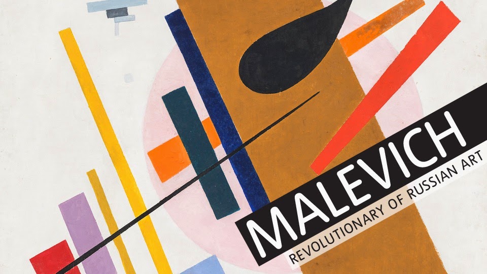
I visited the Tate Modern a few weeks before we were set the 3rd prompt which was to use chosen materials/objects to create a series of images which would represent our designers aesthetic. I visited the retrospective exhibition displaying the works of Kazimir Severinovich Malevich. Malevich was the founder of geometric abstract art and the originator of the avant-garde, Suprematist movement. 
His early experiments as a painter led him towards the invention of supermatism a bold visual language of abstract geometric shapes and stark colours, epitomised by the Black Square. One of the defining works of Modernism, the painting was revealed to the world after months of secrecy and was hidden again for almost half a century after its creator?s death. Visiting this exhibition really helped me to think out side the "photography-box" and consider representing our designer through collage and different mediums. Iin the workshop I feel like I didn't illustrate Paula Gebase's work, but what it did help me do is work freely with different materials. I later came home and  reflected on my visit to the Tate modern, it helped me to create images that depicted geometry and simplicity through collage. These two aspects are highlighted in my designers work, as well as tactility, and to exploit this concept i decided to simplify previous images used for the project and replace the simplified line drawing with mixed media. I used a verity of different materials such as paint, print, pencil, pen, corrugated card, fabric etc? I feel that utilising and exhausting previous experiments is useful to create new ideas, I ended up rather happy with my personal final outcomes for this prompt


(Authors Own - First Attempt at Representing 1205s Aesthetic Through Collage)
(Authors Own Edited Response Representing 1205s Aesthetic Through Collage)
(GROUPS FINAL IMAGES, Highlighted Red - Authors Own)

After visiting a number of exhibitions together we got a feel for the type of images is we wanted to make. It was the general idea to stay away from photography seeing as we has already explored that area competently. As some people in the group were more able than others to create physical imagery rather than technology-based imagery, it was a real learning curve to some of us. We think it really helped our group as a whole because we all had completely different ideas of what to create, where to start and what to base it on. Some people, admittedly had no experience in this field what so ever so found it difficult, but as a group we all helped out to ensure that everyone had a say in the final images. 


Prompt 1 - Designers Aesthetic - 1205

PROMPT 1: 
As a group, choose 5/6 words that describe your designer’s aesthetic.
Together as a team, create 5/6 images that visualise the words you have chosen. It is up to the group to decide how the images are made, what materials you use and how you collaborate together to make them. 

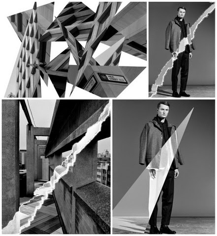
As I chose the words Geometrical and Tactile I decided to use these words to experiment with. I looked for geometric architectural structures and/or patterns and simply photographed them. Photoshop manipulation is something I feel confident using, so i decided to use this skill to manipulate some of my imagery. I also experimented with manipulating some of 1205's previous photo shoots so that the group could get an idea of how it can work for the brand.
(GROUPS FINAL IMAGES, Highlighted Red - Authors Own)
(Authors Own)


Although our final images appear to be just photographical, a number of us did experiment with different mediums. We thought that as "Tactile" was one of our descriptive words, we would try to portray this concept through manipulation. As we had already used photography as our initial response we thought it would be silly to start over. We decided to use paper  manipulation both physical and photoshop based to achieve this concept. We explored many avenues of paper manipulation: Crushing, Burning, Tearing, Crunching even simple cut and paste. We discovered that some worked better than others based on the collection. 

In addition to that, we found a medium that gives tactile property – Moulding Paste. Modeling paste is an acrylic medium that is filled with solid material. The result is a thick white substance that can create a controlled textural surface. With brush or any tools, we can make the texture that we want and leave it dry. When it dries, it becomes an opaque white when it dries. After that, we can paint, write, or do anything on top of the texture. Therefore, this is considered to be a good medium to be incorporated in following prompts.
For the word "Geometric" we came up with some ideas for pencil drawing where we looked into unique building structures in different parts of london and roughly drew them on a sketchbook(which we carried everywhere). 
We found it quite hard to represent the word "Androgynous" without using the human form (which we didn't want to use at this stage in the project). So close to giving up with the word an image was created through printing technique using a gloss varnish.


(Experimental Techniques - Photoshop, Authors Own)
(Experiments - Photoshop, Authors Own)