Showing posts with label experiment. Show all posts

Monday, March 2, 2015

Cut & Paste

(Photography Damien Blottiere, Styling Robbie Spencer, Models Christian Ochsenfahrt at Major, Victoire Macon Dauxerre at Elite)

Cut and Paste -Dazed & Confused.This is a shoot that Robbie Spencer worked on for Dazed and Confused - Calvin Klein - with photographer Damien Blottiere. Each image is merged by two separate shots in a collage manner, creating shapes and gaps that unveil a little of the other. These days images appear flawless and almost perfect with little need for physical alteration, but I think that the beauty of these images lie in the simple, old fashioned medium of cut and past. They're abstracted by this practice, creating another dimension to each image. Although these images are highly modified and very abstract, I do not intend to replicate this visualisation entirely through my own work. I do however aim to experiment with this idea of manipulating two images together to create one. I explained previously that I lacked whole outfits with the samples I wanted to photograph, so the idea of manipulating the two together could ensure than my idea goes further.


(Photography, Bela Borsodi in Cut & Paste" by Richard Brereton)

Bela Borsodi.I came across an amazing book called "Cut & Paste" by Richard Brereton which brings together over 250 images from more than 40 contemporary collage artists. In the digital age that we are living, most images are created using computer based programs, that tend to look very "computerised" and sometimes obvious. When exploring the idea of cut and paste in Fashion photography it became apparent that traditional methods of visual art are fading I aim to try and use the medium of cut and paste in my final imagery to create new ideas based on the smaller samples I have collected from my designer. I came across graphic designer and photographer Bela Borsodi, through combining aspects of fine art, graphic design, craft, and psychology, his work offers a surreal imagery that makes clothing and accessories 3-dimensional. Borsodi says of his work “I love making things and putting things in an unusual context incorporating various visual languages coming from art and graphic design–eroticism is also a fascination of me that I love exploring". Borsodi does in fact use a meticulous method on a computer based programme like photoshop to create these amazing cut and paste images, but they still have a traditional feel about them. I would like to experiment with the idea of cut and paste and play around with scale and proportion in the same way.


(Authors own, experiments with samples)


In the images above I have tried to capture the diverse nature of the garments that I intend to use, and how would like them to be portrayed. The green garment is curvaceous and and quirky and works well with the female body, whereas The pink garment is fun and bouncy and has a lot of volume and character to it. With this in mind I think I have already achieved depicting the green garment in this way, and the plans I have for the pink garment coincide with its characteristics. I recently discovered the concept of using one garment and displaying in two very unique with ways, and as I now intend to use the idea of cut-and-paste in my work, I have come up with an idea that can transform a small orange sample into a finished garment. A problem I initially faced was not having enough samples to create garments suitable to cover the body, I was also in doubt as to how I could use one of my models for a second time throughout the editorial. But with my recent experimentation with the idea of cut-and-paste I aim to use the same sample that appears as a collar in one photo and transform it into a dress for another. I have suggested way I could display the collar as a dress on a miniature figure, but a problem I have faced is finding out ways in which I can display it on the body without making it look too sexy. I aim to re-photograph the orange sample and style it in ways in which I think is suited to my model.


After researching various artists that use the technique of cut and paste I decided to roughly try it out myself. As I have only photographed head shots of my model (that I would like to be seen in the longer garment sample), I had to improvise with images on Google to create the rest of the body, which I would like to avoid in the final outcome. For my final outcome I will have to re-photograph the models body in tightly fitting clothes e.g. a leotard or underwear, so that everything is in proportion and looks realistic. As you can see above I have experimented with with scale, I photographed some of the pieces in a studio so that the quality was of a professional, usable standard. I think the idea is progressing but it needs a lot more attention to detail so that the final outcome will appear more professional.  I aim to re-photograph the models body in in a studio So that I have a realistic backdrop with realistic shadows etc... Below shows how I have experimented with repetition using cut and paste with a sample or garment. I think the continuous flow of the curvy samples is effective, and in some cases works really well e.g. the shoulder piece that is presented in image one.  This idea could also help me to create a final image, depicting  larger garments that can cover the entire body, to work alongside a full body shot but I aim to capture. 


Tuesday, January 20, 2015

Final Images - 1205 - Group & Individual

(Group final images in blog format. 
Assessed Format, A3 with thin black boarder.)
(Week 1 Experimentation, Authors Own)


(Week 2, Photo shoot, Authors Own)
(Week 3&4 Collage & Set Design, Authors Own)


(Week 5 Typography, Authors Own)

Tuesday, January 13, 2015

Prompt 4 - Set Design - 1205

Set design includes all the scenery, furniture, backdrop and props an audience see. A set designer's job is to design physical surroundings that gives the audience information about the brands concept.
  • suggest the style and tone of the brand
  • create mood and atmosphere
  • give clues as to the specific time and place of the action

Ive decided to contrast to the previous style of work i have recently looked at. Looking into the set design of brand "House of Hackney" House Of Hackney is a clothing and interiors label specialising in British made goods with a store on Shoreditch high street, based in the East London shopping district of Central London. It plays on traditional English design and the products, with the exception of the Italian bed linens, are made in Britain. House of Hackney is a print-based lifestyle brand and each season the brand emulates a specific print throughout the store.
Set Designer Suzanne Beirne has designed amazing sets for House of Hackney editorial shoots. They are fun and exciting and i think they represent the brand really well. She has also created Window displays one i like in particular was the one inspired by the great British seaside. 

"How did you bring it to life?"
"I was really inspired by the beach scene in the film Death in Venice and so tried to create a story around the products, a feeling that our girl was having a great time on the beach and had just left her deck chair to go for a dip in the sea. Although as much as this product looks great on the beach, it would work just as well in a garden. I set about making the props that would help set the scene, like covering a rubber ring in the Palmeral fabric, as well as some retro sunglasses and a bucket and spade, then I created a House of Hackney green cocktail complete with Palmeral umbrella and collated product like the note books, wash bags and ice cream. Once I had everything I set it all up to look like the Hackney girl had been enjoying the sunshine, writing notes, drinking and generally chilling on her lounger, I wanted it to look luxurious, chic and decadent, everything that the brand stands for. The scene was completed with the sand on the floor and the giant Cacti."


Prompt 4: 
As a group, Explore set design and bring in a number of LARGE scale materials that can be used for creating sets. 
Together finalise/manipulate/add/transform your set design images. You may develop your images anyway you choose, but consider how to enhance the aesthetic of your designer by working with the form, colour and texture you created. The images can also incorporate additional drawing, collage, digital manipulation in any way you as a group choose.


Friday, January 9, 2015

Prompt 3 - Workshop & Exhibitions

Prompt 3: 
As a group, identify a series of materials/objects that you associate with your designer.
Using the processes explored in the Week 3 lecture & workshop, use these materials/objects to create a series of images which represent your assigned designer's aesthetic.
Experiment with non photographic processes and methods in your constructions, such as collage, drawing, painting, screen printing etc.

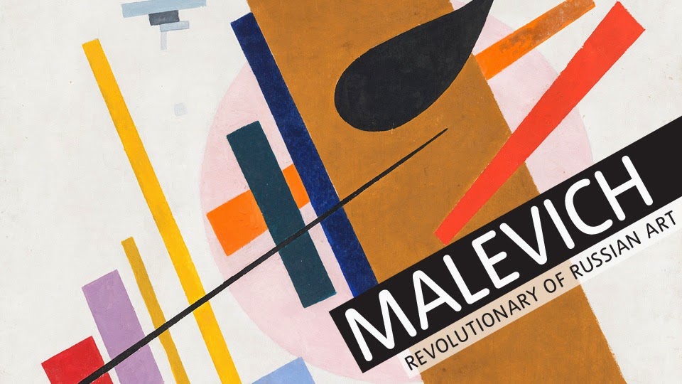
I visited the Tate Modern a few weeks before we were set the 3rd prompt which was to use chosen materials/objects to create a series of images which would represent our designers aesthetic. I visited the retrospective exhibition displaying the works of Kazimir Severinovich Malevich. Malevich was the founder of geometric abstract art and the originator of the avant-garde, Suprematist movement. 
His early experiments as a painter led him towards the invention of supermatism a bold visual language of abstract geometric shapes and stark colours, epitomised by the Black Square. One of the defining works of Modernism, the painting was revealed to the world after months of secrecy and was hidden again for almost half a century after its creator?s death. Visiting this exhibition really helped me to think out side the "photography-box" and consider representing our designer through collage and different mediums. Iin the workshop I feel like I didn't illustrate Paula Gebase's work, but what it did help me do is work freely with different materials. I later came home and  reflected on my visit to the Tate modern, it helped me to create images that depicted geometry and simplicity through collage. These two aspects are highlighted in my designers work, as well as tactility, and to exploit this concept i decided to simplify previous images used for the project and replace the simplified line drawing with mixed media. I used a verity of different materials such as paint, print, pencil, pen, corrugated card, fabric etc? I feel that utilising and exhausting previous experiments is useful to create new ideas, I ended up rather happy with my personal final outcomes for this prompt


(Authors Own - First Attempt at Representing 1205s Aesthetic Through Collage)
(Authors Own Edited Response Representing 1205s Aesthetic Through Collage)
(GROUPS FINAL IMAGES, Highlighted Red - Authors Own)

After visiting a number of exhibitions together we got a feel for the type of images is we wanted to make. It was the general idea to stay away from photography seeing as we has already explored that area competently. As some people in the group were more able than others to create physical imagery rather than technology-based imagery, it was a real learning curve to some of us. We think it really helped our group as a whole because we all had completely different ideas of what to create, where to start and what to base it on. Some people, admittedly had no experience in this field what so ever so found it difficult, but as a group we all helped out to ensure that everyone had a say in the final images.