Due to the unconventional nature of the garments in my shoot, I thought it would be a good idea to get a test shoot out of the way with to highlight areas in which I needed to improve. I started this process by thinking about what sort of models I'd like to cast for my shoot. I decided that the pieces would probably create a better aesthetic on "real" and "interesting" looking models, contrasting with the experimental samples. I recored the process, and above shows some of the people I would like to cast in my shoot. They vary in age, gender, height and race. Since the project is based on the theme of diversity, I think it is easy to "tokenise" models, merely using someone to indicate allegiance to a particular group of individuals. I think I have avoided this issue by using models I think can bring the garment to life, rather that just a pretty face.
Following the casting process, I decided I would benefit form arranging a test shoot, so I chose the most readily available model and conducted one in a pop-up-studio. The idea of the test shoot was to experiment with styling the samples on the body in a variety of ways, but as the samples are not finished garments it proved difficult to “adorn” the body substantially. This task was extremely helpful to me as it encouraged me to style the samples in various different ways, and helped me to guide my usual style towards something more interesting and unconventional - which i think is needed to celebrate these pieces. The samples have an abundance of diversity in the ways in which you can style them on the body, but I noticed that they were too small and too incomplete to fashion a whole 8 page editorial.
I didn't want to scrap my idea because the samples I have decided to use are stunning in so many ways: shape, colour, texture and most importantly, versatility. To overcome this problem I created ways in which I could make the samples go further in terms of “outfits”. I experimented with colour correction to begin with and produced some mediocre outcomes. But something that really interested me from my previous visit to the Guy Bourdin exhibition at somerset house, was his use of scale. Extreme post production of images is something I am not fond of, as I think it can lead to amateur results, but after experimenting with scale in photoshop in a similar style to Guy Bourdin, I realised this might be a way forward in my project. Above shows a small percentage of the images I have taken for the test shoot. As you can see the light changes half way through the shoot, this is due to one of the bulbs in the flash kit overheating and breaking. Even though I encountered a problem during this shoot I carried on, and ended up producing some images that could work well as a final. Although the test produced some good results, the contact sheet clearly demonstrates the lack of material / outfits.
As a Group create a series of 5/6 images that represent your assigned designers aesthetic using only type.The series of images can incorporate drawing, collage, photography, digital manipulation in any way you as a group choose, but must be created entirely from letters and words.
Individually I started to look at simplistic but creative type faces on google. As a group we decide we needed to keep it simple to represent 1205's aesthetic, so I investigated very monochrome designs. Although 1205's current typeface is as simple as Ariel font, I thought it would be interesting to play around with ideas to make it more "fun". I came across loads of 3D fonts that would work really well, creating shadows and texture, I felt that texture was an important factor in our final typography style. To move away from my preferred medium of photoshop I decided to help create physical 3D font using card. At the time brown and black paper were the only colours available to work with, which hindered the final aesthetic. We did persuade the idea using photoshop but agreed it didn't look right.
We all decided that Substance, Purity and Restraint were perfect words to work with, as well as the brands iconic 1205 "logo". We decided this after our visit to the store, noticing that these words were the ones displayed on the garment labels.
Using trial and error - similar to a technique displayed above - I accidentally discovered the beauty of embossing. With only a week left until the final hand in date it seemed unrealistic to attempt to create this idea physically. I turned to the editing program illustrator and drew a very thin typography by hand and embossed the letters. With a white on white aesthetic I think the outcome was perfect for the brand. I can also imagine the idea being printed for garment labels. Below (In Red) shows my individual contribution to the final 5 images.
(GROUPS FINAL IMAGES, Highlighted Red - Authors Own)
In groups we were asked to research an allocated NEWGEN designer with the sight of produceing a group portfolio of 5 images produced over term one. We will be carrying out ongoing research and experimentation using different mediums. Each week we will be given a self directed task and a group prompt to create imagery.
PAULA GERBASE - 1205
"People call a woman in trousers androgynous, but they've been wearing them for so long that for me it doesn't really count. A better term is unisex"
"I never wanted my name up in lights," says Paula Gerbase, the founder of 1205, explaining her deliberately anonymous brand. "As a label we focus on the clothes." She purposefully doesn?t put her name on the label, instead opting for 1205, which in the past she has claimed is her birth date or the date the label was established, neither of which she will settle on, stating instead that it ?means anything to anyone and is about anonymity?.Gerbase's work is often described as androgynous. While her silhouettes tend to be loose and her collections designed for both genders, Gerbase considers the term outdated.
Because Magazine
Fashion Features Director at Porter
Kay Barron
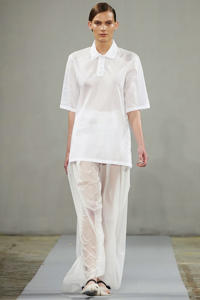
Aesthetic: essential, high quality, comfortable, elegant and unisex clothes. Attention to detail and a focus on fabric retain a femininity in bespoke tailored structures and masculine cuts. 1205 proposes to deconstruct the binary gender system in
fashion. Her design doesn't look for the femininity in menswear or the masculinity in womenswear, but instead aims to overcome the paradigm to get a pure and timeless but smart and wearable elegance. A straight palette of navy, black, white and every shade of grey characterises the entire collection, where Gerbase adds impeccable tailoring and skilful refinements to loose edges and softer shapes. The quality of the fabrics, like classic wool, jersey and mohair mixed with nylon and silk emphasises the stunning craftsmanship in these creationsFrom top to toe, Gerbase's pieces seem to express a widespread desire for continuity from a man's wardrobe which ceases tobe borrowed and eventually can simply be shared.
Geometry:
1205 is influenced by the formal precision of geometry and the vital elegance of nature; starched collar stands lend a formality to otherwise eased volumes and raised textures, coats reinterpret tailored constructions in technical fabrics, formal trousers are offered in new shapes, knitwear features 1205's distinct asymmetry
"To me masculinity is about attention to construction, how a shoulder is put together or the type of canvas I am using. The feminine aspect can be about a contrast of Textures. Texture is very sensual I think. It's this interpretation of unisex that I like to explore."
1205 designer Paula Gerbase talks to Dal Chodha about redefining old-fashion notions of gender.
By Dal Chodha
Her clothes don't scream "I'm standing out, look at me!", instead they seem to whisper with a poetic charm. "Meet me, touch me, try me, I'll be with you forever, and you won't regret it".
Androgyny:
Tailoring is minimal and restrained - meaning 1205's pieces give a graceful aesthetic that is no-nonsense but relaxed. When talking about the lack of fussy detailing, Gerbase explained
"Everything else around us is so busy and if you let go of all that stuff, people notice. Clothes are about framing a personality and although you're making a choice about what you are wearing, ultimately, it really isn't ever about the clothes."
Interview-Naked Fashions:
Gerbase studied at Central Saint Martins, where she believes taught her “strength.” From there she went on to apprentice at the prestigious Savile Row with Hardy Amies atelier which allowed her to progress to a creative director job at Kilgour for five years. Savile Row is widely known as the Crème de la Crème of fine, British tailoring and it was here where she explored and acquired new knowledge.
“The subtle thought process and continuity of a mans wardrobe has always interested me”
“sharpening her senses for detail, trims and cuts”
“I have always loved mens clothing for its attention to detail, focus on fabric, cut and considered construction, and have worn mens pieces for as long as I can remember.”
“playing with contrasts of formal/casual fabrics, shapes and [as always] introducing new fabrics such as waterproof flannel…as ever, the focus was on subtle details and texture contrasts.”
Fabrics are a huge part of the 1205 brand as there are no prints and extreme cuts to distract from the composition. When choosing fabrics Gerbase looks for thoughtful, intelligent fabrics developed by the best fabric mills in the world.
Interview Naked Fashions
Interview with designer Paula Gerbase (1205)
Lauren Johnstone
SS13:
"For Spring/Summer 13, I've not only embraced my Savile Row side but for the first time I've looked at the country in which I was born, Brazil. It's the first time ever that I've been inspired by Brazil. Normally I look at architecture a great deal and it tends to be German but for this season I looked at Brazilian modernism of the 50s and how it included a natural element, both the build itself and the natural environment are considered. I was interested in the fact that they always have an architect and an urban planner on all builds who looks after the planting and green credentials. There is a lot of green in this collection. Up to this point, I've been so controlled with my palette and this time green was the big accent. In terms of research, as I'm not looking at it from a foreigners perspective, I knew where I was going, where to look and of course my family helped. Some of the shots are of my home town. From prints that I designed based on insulated walls and wall paneling that are so common in Brazil and these evolved in to jacquards. "
Mood Board For SS13 Collection
"The real starting point was finding a book called Building Brasilia by this French photographer Marcel Gautherot. Gautherot documented the entire process, from desert to the completed city. From untouched grassland to skeletal structures to ultimately the realisation of a modern capital and touching on the works who played their part in shaping it. It's an amazing book. I was drawn to the human side of architecture."
Style Salvage
Blog
AW14
For autumn/winter 2014, Gerbase took inspiration from sculptor Barbara Hepworth and the artists who colonised St Ives in Cornwall during the second world war, living alongside the local fishermen. The references are clear in smocks, overalls, fishing jumpers, blanket coats and wide-legged trousers, in leather, mohair and marino.
Gerbase loves the idea ? which she sees as typically masculine ? of curating a wardrobe over a lifetime, instead of buying clothes that put the wearer's body on show for others. Her label isn't showy, but every garment includes a "little code" or "hidden message": small, deliberate 'mistakes' "like the wrong-coloured right cuff or an unexpected internal pocket," she says: "With these surprises I try to communicate with the person wearing the clothes in subtle ways."


 I didn't want to scrap my idea because the samples I have decided to use are stunning in so many ways: shape, colour, texture and most importantly, versatility. To overcome this problem I created ways in which I could make the samples go further in terms of “outfits”. I experimented with colour correction to begin with and produced some mediocre outcomes. But something that really interested me from my previous visit to the Guy Bourdin exhibition at somerset house, was his use of scale. Extreme post production of images is something I am not fond of, as I think it can lead to amateur results, but after experimenting with scale in photoshop in a similar style to Guy Bourdin, I realised this might be a way forward in my project. Above shows a small percentage of the images I have taken for the test shoot. As you can see the light changes half way through the shoot, this is due to one of the bulbs in the flash kit overheating and breaking. Even though I encountered a problem during this shoot I carried on, and ended up producing some images that could work well as a final. Although the test produced some good results, the contact sheet clearly demonstrates the lack of material / outfits.